CHA 2015: Tim Holtz and Ranger Present the Distress Ink of the Month

cha (2) copy

While the suspense is KILLING me, I do believe the idea of releasing a new (surprise) Distress color each month is a wonderful idea. I love this presentation from Tim Holtz and Ranger for so many reasons:

  • gives us (the consumers) just one color a month to think about and/or consider adding in some form to our collections
  • lets us pick which products we want to add – no more waiting months for the spray or the marker or whatever item wasn’t offered at first!
  • gives store owners a wonderful opportunity to make an event out of the reveal each month, as well as a lovely little display for their stores
  • gives us all something to watch for each month!

I just love that from every aspect as consumers (or store owners!) Ranger has made this a really fun way to make 2015 the year of Distress Ink. I have several ideas rolling around my head for ways to showcase this and future colors – stay tuned! They’re keeping future colors VERY secret until reveal – so no I don’t know what else we’ll see!

cha (1) copy

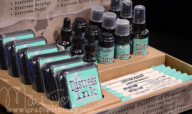
Note for mini ink pad fans – they’ll release after four months (Example: Jan > April) in a set of four. All the existing/older colors of distress? Those are available in mini individually now!

My personal hope – and yes I want to go on record with this in case I’m right – is for some kind of an orchid color between pink and purple. Oh how I’d love to see that presented in a special month… May!! 😉

cha (3) copy

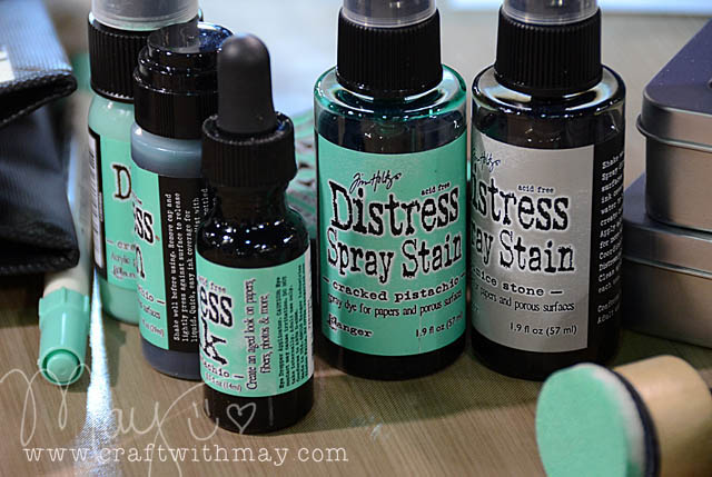
January’s Cracked Pistachio is now available for pre-order at Simon Says Stamp as a set and should be shipping soon. Ranger promises a color each month – but there is not a set reveal or shipping date at this time. I don’t know if they’ll change that or if we will simply have to stay tuned each month for the surprise…

Distress 101 [and an exclusive discount code!]

It has been an exciting time around here! I just found out (shhhh!) that Big Picture wants Camp Scrap to come back as an (all new) class this summer – you heard it here first! In the meantime I’m keeping busy with lots of fun projects including getting ready for opening day of Field Guide – the FINAL run of my 12 week technique, video, project, and craft-stravaganza class at Big Picture. If you’re interested or want more information you can find it here.

Now, I’ve been here in the studio filming videos and making bonus lessons to add into Field Guide, and as long as I had the camera out and was in the zone I thought… why not make a distress video to share here on my blog? I get asked all the time about how I use distress products (ink, stain, markers, and now paint), and what the differences are. So – I present to you a 20 minute “distress 101 primer” class:

[link to you tube]

Here are links to the complete collections, some surfaces I used in the video and/or recommend, and also my top five most used distress colors in ink pad, pen, and stain: 

Funny enough – you see a lot of orange and yellow here and those are so NOT favorite colors of mine, it just so happens that they get used a ton. It is important to think about what colors you’ll use (vs which you find prettiest) when buying inks and color mediums for sure! As much as I adore my purple distress colors, they don’t see a ton of action. So because some of my favorite (but less used) distress colors are not represented, here are my personal 9 favorite colors not already mentioned above.

(I’m just showing these in ink pad form – but all are available in some other form as well)

Well there you have it – I hope you’ve enjoyed this mini course on how (and why) I love distress products! I feature projects with them here on a regular basis of course, and I share a lot more videos, tips, and ideas in my class that starts in a few days Field Guide as well! If you’re interested in joining that class be sure to do so soon – registration ends in just a few days.

If you have any distress (or Field Guide) questions – feel free to ask away!


My friends at Simon Says Stamp are offering a special discount code just for my blog readers! Use the code RANG20 now through February 4th to receive 20% off of all Ranger products So if you’re looking to add some distress colors to your collection – or any other Ranger goodies now would be a great time!!

Specialty Stamping Paper

After hearing a lot about the new Ranger Inkssentials Specialty Stamping Paper I finally succumbed to the enabling and purchased a package to see for myself. 

At about $.80 a ( 8 1/2 x 11) sheet it is 3x more expensive than my average sheet of white cardstock I stamp on. To be perfectly honest I expected to feel let down or indifferent. Instead I was blown away + amazed + preparing to order it in BULK. Holy wow. Ok here’s why it is amazing: no warping or pilling.

If you want to do distress ink/marker play, or a lot of stamping or marker technique or that kind of stuff and your normally have issues with paper getting warped or yucky or bits of the paper rubbing off – you NEED this. wowza. I can’t recommend it enough. I fully soaked this paper, used multiple layers of color, heat tool, and all kinds of stuff and yet it held. perfectly flat. No issues here.

As I played with my first sheet I had the video running (so I could see how to re-create what I came up with – not because I intended to make a video to share)… and it’s short so I think I’ll share my process. Here it is:

link to youtube]

My big tip would be to cut a piece of paper the approximate size you need first. That way you don’t get the rest of the sheet colored on/dirty. I’m using this first sheet as a trial/error/play sheet so I’ll be filling it (both sides) with random experiments and not thinking about finished projects or use.

The closest comparison to what this paper feels like is matte finish photo paper (except thicker and both sides are the same finish).

Have I mentioned I’m super impressed with this paper?

It is available in 8 1/2 x 11 and ATC size from Ranger – I’d suggest the bigger size (you can always cut it down) unless you’re making ATCs.

Links to supplies used:

Distress Stain article is up!

Last week I posted a video showing me + distress stains + stamps. Well this week, my distress stain article is up at Scrapbook Update! Here is the link:

http://www.scrapbookupdate.com/2011/08/08/how-to-tim-holtz-distress-stains/

I am the teeniest bit OBSESSED with these. (heh) I so LOVE them. More videos to come for sure. For now, I know a lot of you had asked me to post more about them and I hope you like the article! If you’ve got questions feel free to ask here or via email (or at the article itself). You’ll find an all new layout over there showing some of my favorite colors (Mustard Seed – who knew?!) in action too.

Happy Monday!

A stained spring…

I have a new obsession this spring – and that is Tim Holtz distress stains. If you’re taking a class from me at a local store you’ll be seeing them in action often. (Above: a spun sugar stained card + stained doily from my “tea party” class coming soon)

Distress stains are the SAME colors as their ink pad counterparts. So WHY did Ranger & Tim Holtz make them? What could possibly be so enticing about them? I think it’s great that they match the ink pads, but also that they can go places (and be applied so smoothly as they are liquid) that previously my distress ink could not go. JUST LIKE THE INK PADS – they can be mixed with paint, water, mist, or anything else you might like and they keep their color. So what am I loving about them?

1. Doilies. I have both been coloring my beloved little paper embellishments AND I have been using doilies as masks and coming up with cool backgrounds too. (you’ll see that in action SOON!)

2. Covering larger surfaces. An entire tag or paper or canvas (or whatever) without any streaks or lines from ink pad, and with a much more liquid/fluid coverage. LOVE!

3. Making dots. LOVE that it can be used as more of a ‘dabber’ and I can dot color wherever I feel the urge.

4. Dab onto slick surface (craft mat or plastic – something that it won’t absorb into) and then mix with water, mist (I LOVE perfect pearls mists for this), or other medium and use paintbrush to apply as shown above.

5. Here I mixed with liquitex iridescent medium (think sparkly thin white paint) and covered a canvas. Then I went back and accented the canvas along the edges with the brown distress stain a bit more.

Stay tuned… I will be sharing installments of this particular project as I work on it…

So that’s 5 reasons I’m obsessing over distress stains. If anything they’re replacing some paint and mist use for me – and they’re quite convenient. I hope Ranger releases ALL the distress colors in time. Right now I have (and LOVE): Spun Sugar, Wild Honey, Vintage Photo, and Antique Linen.

I’m going to be adding to my collection VERY soon. *LOVE* them!!

PS – I’d recommend www.simonsaysstamp.com for on-line shopping for these.