Galaxy technique (stamped) bookmark

I’m really digging the “galaxy” colors since anything that works with purple is a win in my book. While it’s one of my favorite colors it does tend to be harder to work in! So today I decided to pull out some stamps, watercolor paper, and make myself a new bookmark.

Continue reading “Galaxy technique (stamped) bookmark”

First day of school teacher cards

First of all pause: How am I the mom to a 3rd and 5th grader?! I really don’t know how time went and flew so fast…

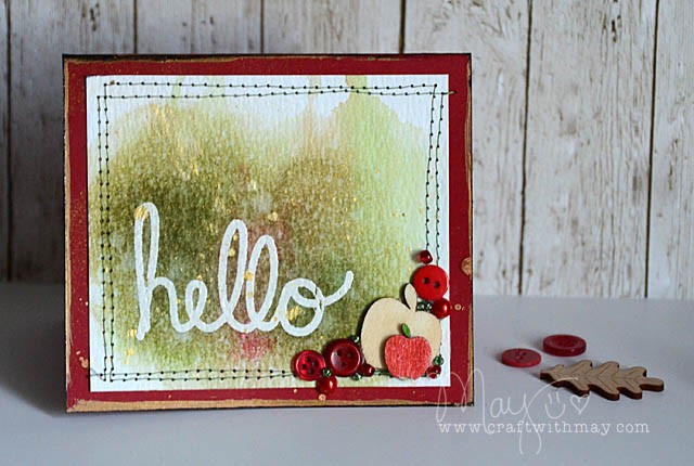
card1_detail

More than once I’ve thought to myself that I ought to drop a hello note introducing myself and thanking (in advance) the teachers on the first day. Thing is… I always think this thought oh as I’m driving home after the first day.

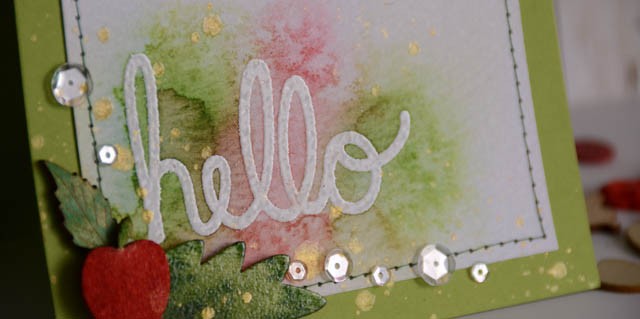
No more! So on the final day of summer break I sat down with a “hello” stamp (old one from Elle’s Studio) and played for a while.

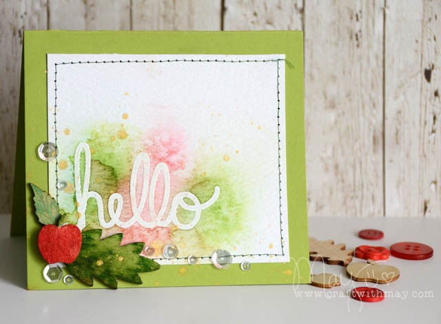
card2_blog

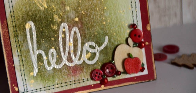
The cards you see here are the 4th and 5th attempt. #1-3 were bombs! That’s ok! I was trying a few different things and I’m always happy to do tests and trials with new ideas most especially.

card1_blog copy

But wait, there’s more! I created a tutorial so if you’d like to watch my process here you go! (link to YouTube)

Now, off to school and to drop these cards!

card2_detail

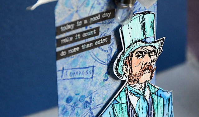
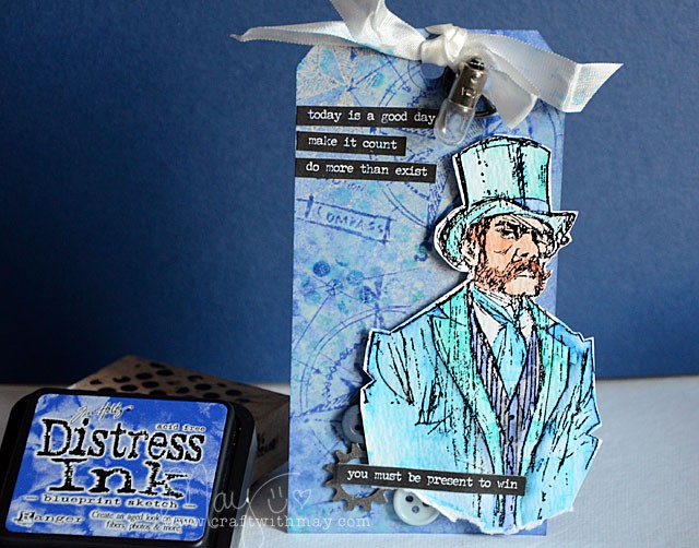
This gentleman doesn’t often distress…

DSC_4060

but when he does, he prefers Blueprint Sketch! The new Tim Holtz Distress color? AMAZING. I’ve created a video showing it compared to other blues.


link to YouTube

Here is my first project using this color:

DSC_4083 copy

This new color is definitely a favorite – you’ll be seeing it a lot!

links to some supplies used:

no ordinary paper…

DSC_2605

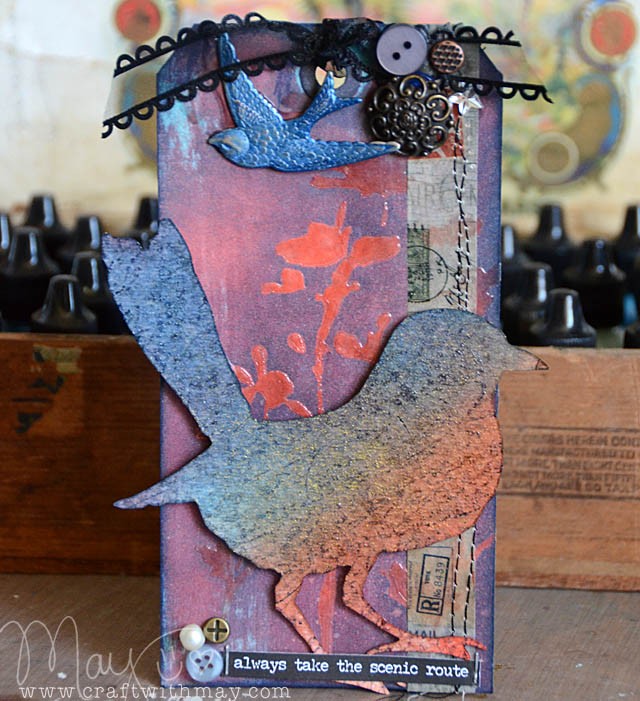
The challenge this week? “No ordinary paper”… so I colored watercolor paper. I also inked, stenciled (with glossy gel), and inked again some manila cardstock.

Manila cardstock is totally fantastic for stenciling, gel and paste mediums, and it takes distress ink so well. It doesn’t ball up as quick as plain average weight cardstock either.

Watercolor paper is so absorbent, and I always love playing with blending colors. In this case coral and mermaid were the only two colors used! Then I stamped onto it for more depth, and I sprayed with beloved perfect pearls. All of this and it never warped because I use the super heavy kind!
DSC_2600 copy

As you can see from the results – these “not ordinary paper” papers really helped me create a fun tag!

Supplies Used:

50dollar_voucher_600px

Simon is offering a generous $50 voucher that will be randomly drawn from the eligible entries each week. Join the fun by creating a project this week – and for your chance to win a $50 voucher you should hop on over and join in the challenge here.
CHA 2015: Tim Holtz and Ranger Present the Distress Ink of the Month

cha (2) copy

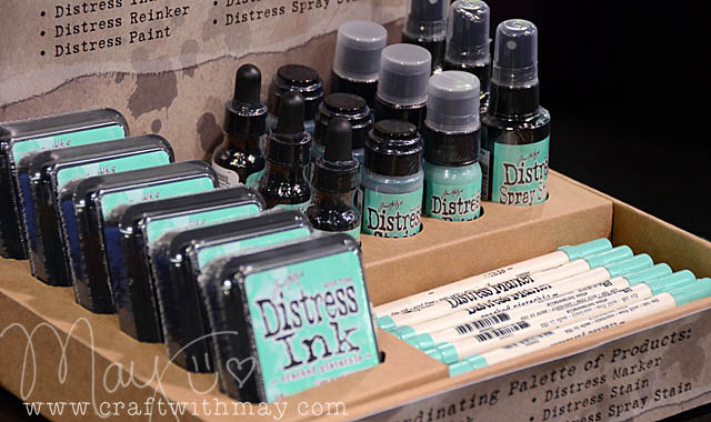
While the suspense is KILLING me, I do believe the idea of releasing a new (surprise) Distress color each month is a wonderful idea. I love this presentation from Tim Holtz and Ranger for so many reasons:

  • gives us (the consumers) just one color a month to think about and/or consider adding in some form to our collections
  • lets us pick which products we want to add – no more waiting months for the spray or the marker or whatever item wasn’t offered at first!
  • gives store owners a wonderful opportunity to make an event out of the reveal each month, as well as a lovely little display for their stores
  • gives us all something to watch for each month!

I just love that from every aspect as consumers (or store owners!) Ranger has made this a really fun way to make 2015 the year of Distress Ink. I have several ideas rolling around my head for ways to showcase this and future colors – stay tuned! They’re keeping future colors VERY secret until reveal – so no I don’t know what else we’ll see!

cha (1) copy

Note for mini ink pad fans – they’ll release after four months (Example: Jan > April) in a set of four. All the existing/older colors of distress? Those are available in mini individually now!

My personal hope – and yes I want to go on record with this in case I’m right – is for some kind of an orchid color between pink and purple. Oh how I’d love to see that presented in a special month… May!! 😉

cha (3) copy

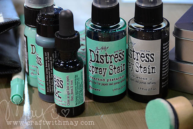
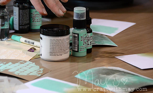
January’s Cracked Pistachio is now available for pre-order at Simon Says Stamp as a set and should be shipping soon. Ranger promises a color each month – but there is not a set reveal or shipping date at this time. I don’t know if they’ll change that or if we will simply have to stay tuned each month for the surprise…