I’m sharing another project from CHA created for Tim Holtz…
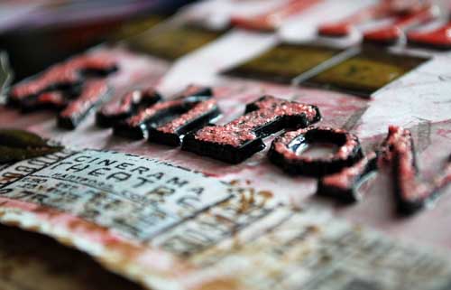
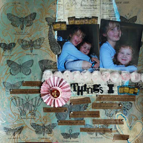
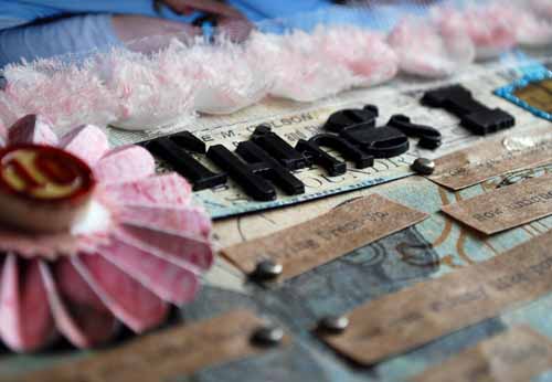
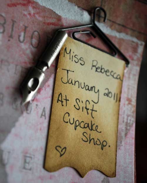
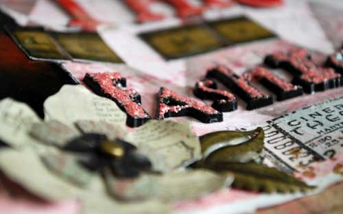
I found that the new black plastic letters can be topped with stickles (shown above). I also coated with Glossy Accents so that it really had a good seal. But truly one of my FAVORITE items had to be the tiny hangers. On this example (below) I folded a piece of cardstock (like a towel) around the bottom bit and inked the edges for a more aged look. I also added one of the new pen nibs – love those too, and the bottom is die-cut with one of Tim’s dies.
I guess what I’m trying to say, is that this layout was pure, 100% creative play. SO FUN. I decided to try and see if I could work in one of my girliest photos (Miss Becca, in a cupcake shop, wearing her most “fashion” outfit)… and I love the results!
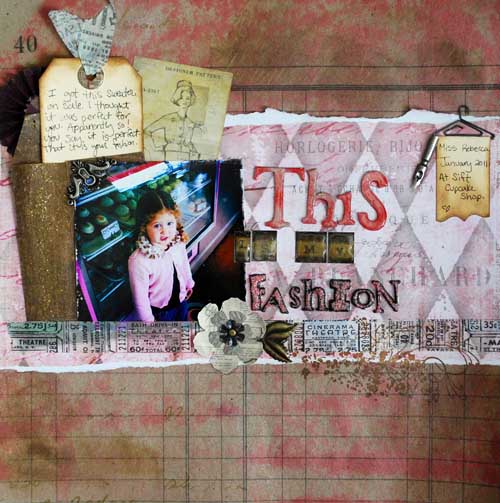
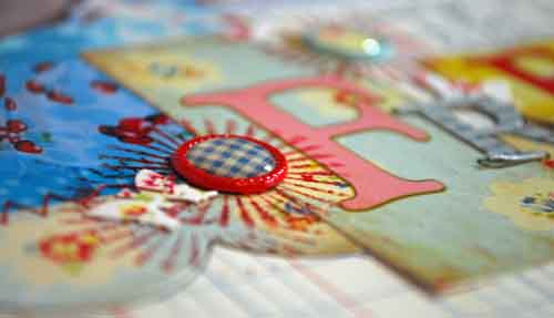
The background is a sheet of the kraft resist paper, and you can see lots of new and older Tim Holtz goodies at work here. The layered flower was created by die-cutting some of the stickers. I’d suggest backing your sticker with cardstock if you’re going to try that at home!
I used one of the kraft glassine envelopes (I used Tim’s texture hammer all over it to get a funky beat up look) to hold my journaling tag. At the top of the tag I used one of the reinforcers (coated with glossy accents & allowed to dry) + some tissue tape at the top of it.
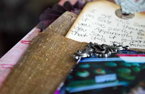
You’ll also see a misted rosette underneath it – it’s actually just a 1/2 of a rosette since I didn’t want it as bulky underneath my journaling where it wouldn’t be seen anyhow.

the letters for “This” are grungeboard topped with distress ink + glossy accents. I use that stuff on everything!!

So there you have it – layout #3 that I made for Tim. So much fun stuff, a lot of which you’ll be seeing in my upcoming in-person classes (once I can get my hands on more!!). If you have questions about the page or anything feel free to ask!
