Tim Holtz: Miss E age 5 layout

Happy National Crafting Month! Although, every month (not just March) is a crafty month around here! I thought I’d share a layout from CHA that I made (for Tim Holtz) today. I hope you enjoy!
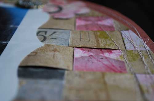
So first off – I wove two pieces of paper (one new kraft resist with one from the vintage shabby pack) together and made sure to secure all edges really good. Then I used a dinner plate as a template and cut it into a circle. Ah but it wasn’t super stable so I put adhesive on the back and stuck it to another sheet of paper, which I cut in an imperfect circle around it. Then I stitched all around the edges (just for fun) and got to making my layout…
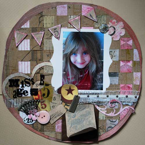
The frame around my photo was die cut with Tim’s bracket die. Most of the goodies used here are new (and from what I hear arriving in stores any day now!) – I’ll tell you a bit more about the layout:
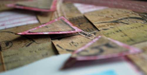
Up at the top I hand cut some triangles to make a banner. Just for fun and because I’m still loving the banner look. I also chose to cut out the “note book” paper piece (from new Crowded Attic paper pad) and journal on the back of it. You can see that is mounted onto a kraft glassine envelope (below).
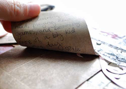
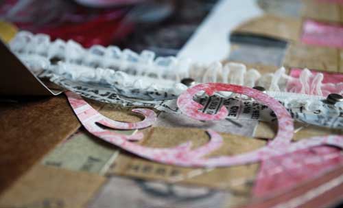
I also called in some favorites from Tim’s previous release – below you can see a strip of his ribbon, a die cut flourish (from Vintage Shabby paper), brads, and some tissue tape.
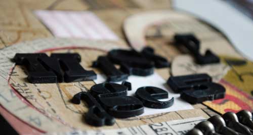
Unable to keep adding to this wild page – I used the new alpha parts for my title, which is inside a cut-out heart that has inked edges. You may also notice I used several number “5” elements in my design, to tie in with the theme and title.
I had such a good time with this layout. Pure crafty fun.
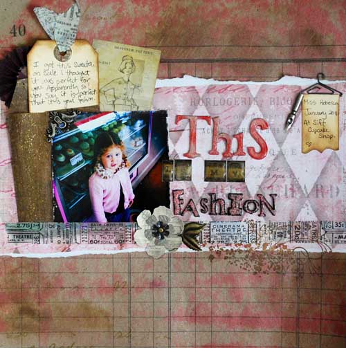
Tim Holtz project: Fashion

I’m sharing another project from CHA created for Tim Holtz

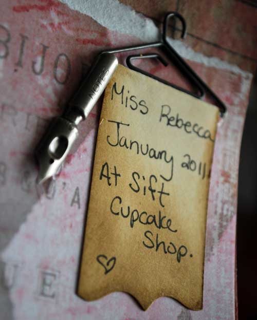
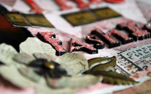
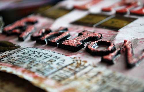
I found that the new black plastic letters can be topped with stickles (shown above). I also coated with Glossy Accents so that it really had a good seal. But truly one of my FAVORITE items had to be the tiny hangers. On this example (below) I folded a piece of cardstock (like a towel) around the bottom bit and inked the edges for a more aged look. I also added one of the new pen nibs – love those too, and the bottom is die-cut with one of Tim’s dies.

I guess what I’m trying to say, is that this layout was pure, 100% creative play. SO FUN. I decided to try and see if I could work in one of my girliest photos (Miss Becca, in a cupcake shop, wearing her most “fashion” outfit)… and I love the results!

The background is a sheet of the kraft resist paper, and you can see lots of new and older Tim Holtz goodies at work here. The layered flower was created by die-cutting some of the stickers. I’d suggest backing your sticker with cardstock if you’re going to try that at home!

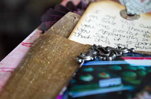
I used one of the kraft glassine envelopes (I used Tim’s texture hammer all over it to get a funky beat up look) to hold my journaling tag. At the top of the tag I used one of the reinforcers (coated with glossy accents & allowed to dry) + some tissue tape at the top of it.

You’ll also see a misted rosette underneath it – it’s actually just a 1/2 of a rosette since I didn’t want it as bulky underneath my journaling where it wouldn’t be seen anyhow.

the letters for “This” are grungeboard topped with distress ink + glossy accents. I use that stuff on everything!!

So there you have it – layout #3 that I made for Tim. So much fun stuff, a lot of which you’ll be seeing in my upcoming in-person classes (once I can get my hands on more!!). If you have questions about the page or anything feel free to ask!

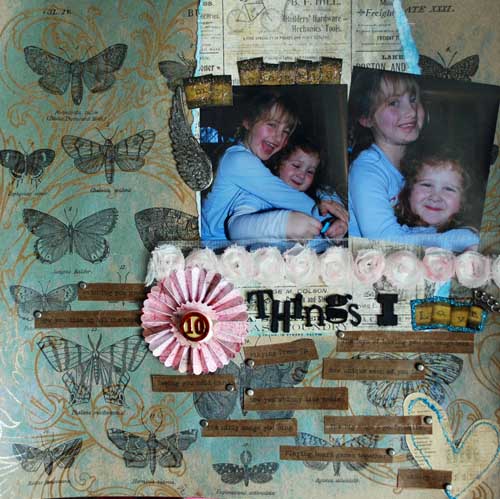
Tim Holtz Project: 10 things layout

Are you ready for another of my layouts that I made for CHA? I hope so! This one is using new Tim Holtz products, and once again features the AMAZING Kraft resist paper. LOVE IT! You can see above how the ink and mists react to the paper – adding color but still showing the patterns.

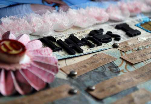
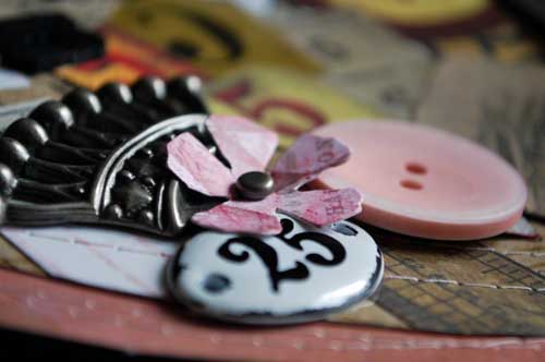
I added distress stickles to the metal wing (love that), I added a paper rosette, trim, and so much more… pure creative fun.

Here’s the full page:

My journaling is done on the kraft glassine that Tim is releasing. I printed my journaling onto white paper, then taped a sheet of the glassine paper over it (so I knew the printing would happen on it) and re-printed. Then it was just up to me to chop it up into strips! Works great!!

Of course because this is a classic “May” page, I had to add some more stickles. Also more of Tim’s stuff. This layout is 100% Tim Holtz products. LOVE IT!

Happy Crafting.

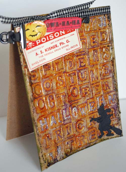
Halloween Card {and give-away}

If you think that so far I’m having a good time being on the Tim Holtz design team, you’d be right.

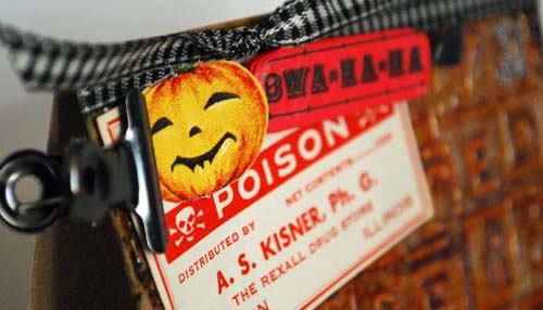
Tim Holtz product used: texture fade, spiced marmalade, pumice stone, and walnut stickles, peeled paint and dusty concord distress ink, metal clip

other: Jenni Bowlin vintage Halloween kit goodies, Martha Stewart candy sticker, cardstock, PPA by USArtQuest (adhesive), ribbon

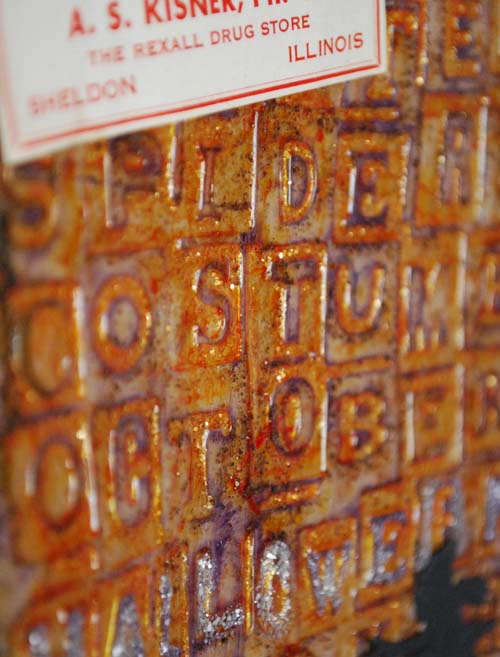
I made another of my ‘glue faux fruit rolls’ and attached to the front of a folded piece of cardstock to make a card. Then I inked, stickled, and otherwise decorated. SO easy!!

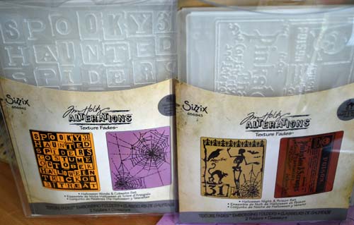
What could be more fun than getting a bit of crazy Halloween goodness in the mail? How about getting a texture fade of your own?

Tim sent me these last week, and he said I could share them with my lovely blog readers. I already have (and LOVE and USE) these texture fades and I can tell you they’re LOADS of fun!! Would you like to get one of these in the mail? Leave a comment here and I’ll pick two winners (and send them each one of the texture fade sets shown above) in a few days. Share your favorite October treat in a comment here, and maybe I’ll treat you!! Good luck.

Halloween Night {glue on canvas project}

Yesterday I shared a video + idea for another way to use texture fades by Tim Holtz. Today I will share my first project with this technique:

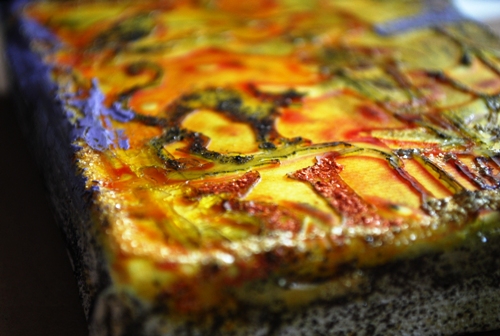
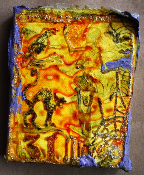
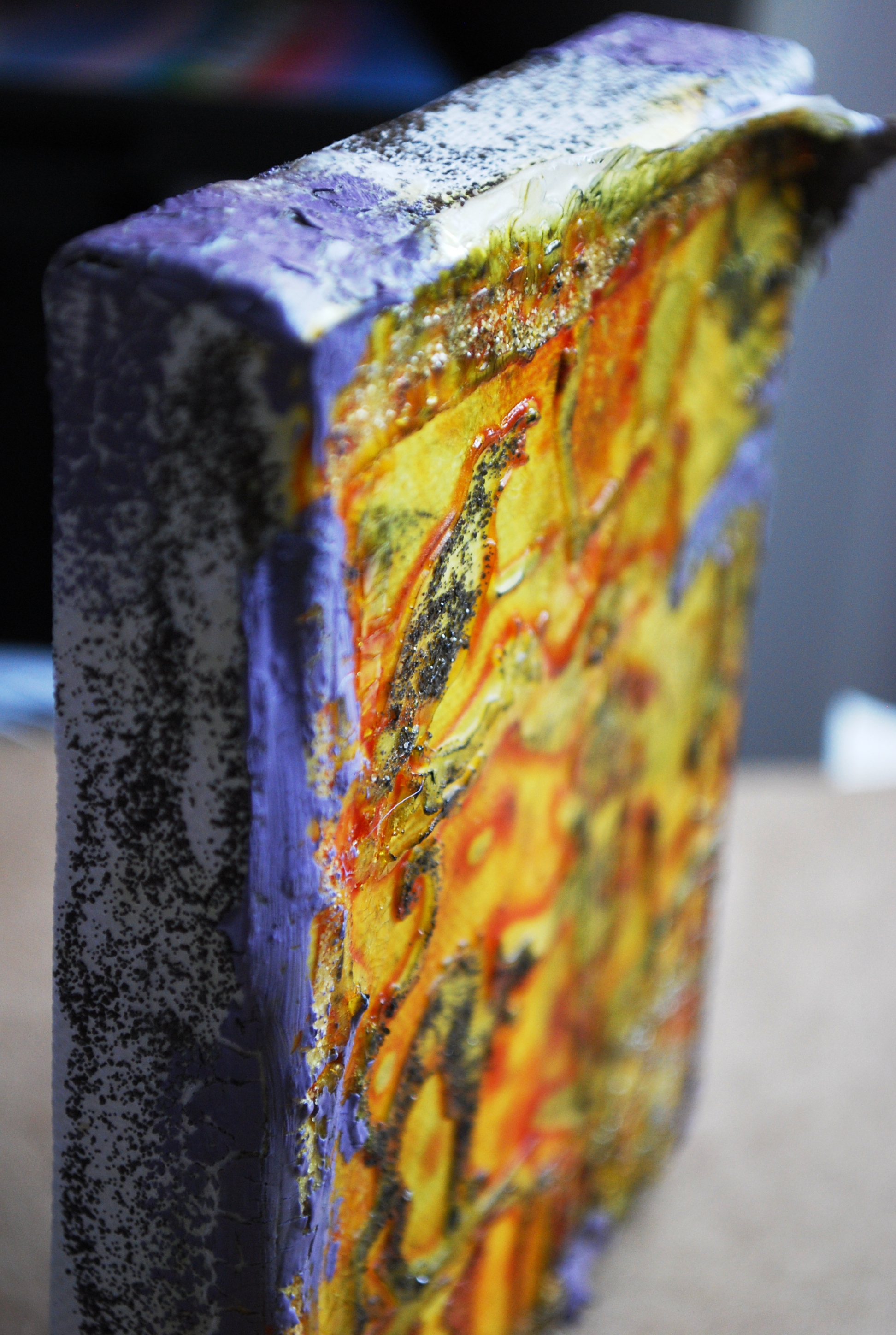
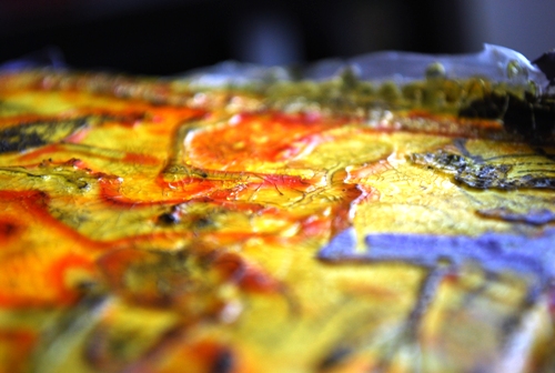
I used the Halloween Night texture fade in this example. I LOVE this one and all the detail it has. Once dry and peeled (the embossed glue sheet, that is) I rubbed a 4×5 canvas with my Spiced Marmalade distress ink. Then I rubbed with liquid adhesive and set my ‘glue faux-fruit roll’ on top. The result? As it dried the ink pooled in a few spots and not in others, creating an uneven orange background behind the translucent glue. LOVE IT!

Then I stickled it to within an inch of it’s life. Ok, not really but you can see I used stickles glitters to accent the cat, number, web, and a few other details.

I also used some Dusty Concord distress crackle paint to accent some edges, and I applied Rock Candy distress crackle paint lightly to some areas – especially the skeleton. Once dry I rubbed over it with black soot to help make the cracks stand out. You might notice I let some edges of the glue sheet stand up. I was TOTALLY ok with that. Really I was just having some fun playing here – and in the process came up with another little home decor piece to add to my spook-i-fied house!!

You can probably tell I’m having a blast with Tim’s products. I really like that I’m finding more uses for them in my craft projects, and truly how easy they are to use and how everything works together.