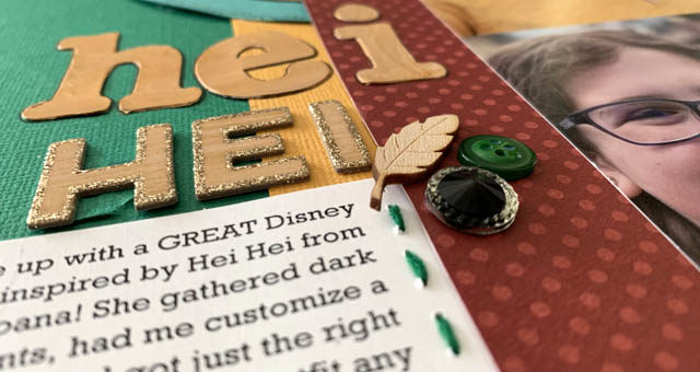
Have you heard of Disney Bounding? Essentially it is a form of dressing in a costume – except not a costume at all! The ‘rules’ if there are any is that you dress in regular clothes that when put together into an outfit resemble a Disney or other character. Fun, right? Well Miss Rebecca is super into this concept and I wanted to create a whole page about here in Disneyland as Hei Hei the chicken from the movie Moana.
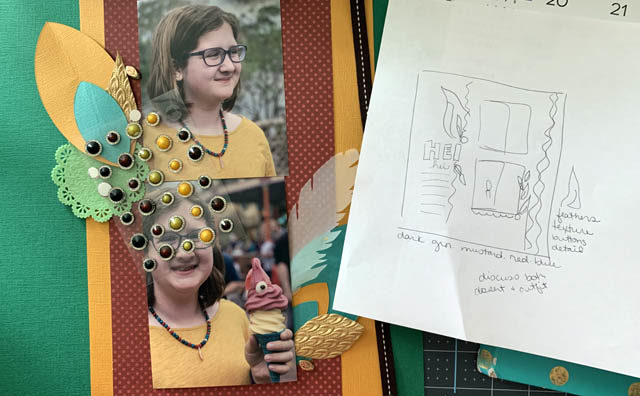
The week had been super busy so this page actually happened over 3 or 4 days. I sketched out my general idea (notice how VERY rough my sketch is – that’s ok!), gathered supplies, and began playing with the idea of feathers and details in this bold color palette.
Due to the subject, this scrapbook page was entirely led by the colors in the outfit/photos! This is a really fun way to add a lot of personality to a scrapbook page without having to think too hard about where to start. So how do you add the right quantities or styles of things to let your photos guide you?
Here are some tips:
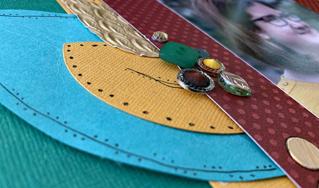
- Whatever the MAIN color you see in the photo, should be less or an accent color. In this example it’s the mustard yellow top. I chose instead the dark green (color of her pants you can’t see!) to balance better.
- Go with what you like! I liked a darker red tone vs brighter for this, and while not perfectly on character I felt it looked just right and added what I wanted mood wise.
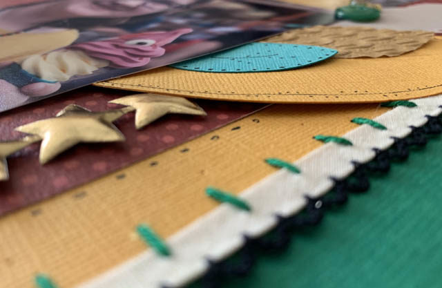
- Texture, texture, texture! Ribbon, thread, metallic items, vellum, textured cardstock – there’s a load of ways to add more texture, detail, and fun to a page. Notice how the gold textured paper and the jewels add that detail to an otherwise “just cardstock” page. Same with my stitching, pen work, and all of the other little details.
- Test it before you glue it. This is ALWAYS my recommendation, but especially with bold colors! Look and see how it goes, if it feels right, and most importantly if you like it. If not, ditch a color and try something else!
Want to see more process on this page? Here is a link to my YouTube video about this page.
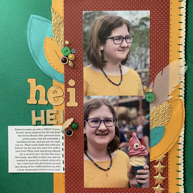
I 100% adore this scrapbook page. I love the textures, the color ratio, the use of feathers, and how this page compliments a perfect moment and outfit most of all. Now sometimes I ignore the colors in the photo (or just make sure my choices simply don’t clash) – but once in a while I find “let the colors guide me” to be a really successful approach.
Do you ever let the colors guide you? Do share!
She is so clever! I love the idea of Disney Bounding but I’ve never done it!
Really great page!!
This is really cool and i like how you worked with the colors. To answer your question… No, I’m not very good with color, and wouldn’t even notice the color in photos.