You know me – I love my distress! In fact- want to know a fun little secret? My next on-line class is going to be 100% about Tim Holtz distress products! Watch for that to be opening for registration in about 2-3 weeks…
For today though, we’re talking challenges over at the Simon Says Stamp blog and this one for distress is going to be a fun week. You could of course go in a direction like distressing edges, or an art journal page about being distressed – but me, my mind went to wonderful distress inks.
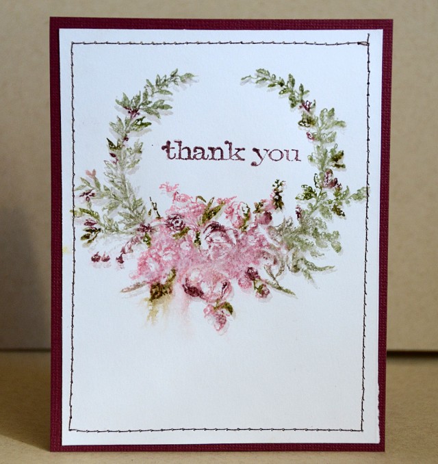
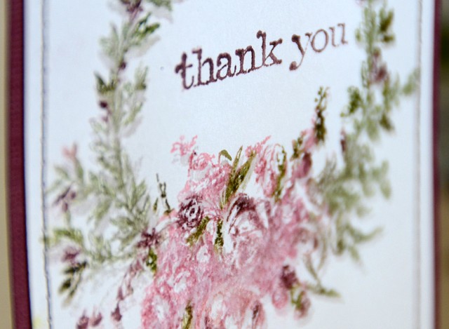
First up, a thank-you card that is simply a stamped (with water added to blend) with distress marker image that was then re-stamped with clear embossing ink and powder and the Thank You sentiment stamped with distress ink. That’s it! Distress can really holds its own.
Speaking of holding its own… the cap’n would like his turn…
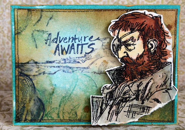
The background is done with distress inks. Stamped with them, and also a foam blending tool all over the surface with them. Then a few squirts of water to make things blend and finished off with the Adventure Awaits stamp.
Our salty friend was stamped in black distress, then heat embossed with black powder. After that I colored him with distress markers which I then blended with a water pen before cutting him out (he is stamped onto specialty stamping cardstock) and placing him on this sea worthy card.
Supplies Used:
 |
 |
 |
 |
 |
 |
 |
 |
 |
 |
 |
 |
 |
|
 |
 |
 |
|
 |
 |
|
 |
 |
 Another Monday, another challenge week! Simon is, as always, offering a generous $50 voucher that will be randomly drawn from the eligible entries each week. Join the fun by creating a project this week – and for your chance to win a $50 voucher you should hop on over and join in the challenge here.
Oh, May, these two cards are so beautiful. The stamping on the first card and the background color scheme on the second one are gorgeous! Wonderful inspiration. 🙂
Both cards are gorgeous! One much more for the ladies than the other 😉 I love the blending of blues and greens in the second one 🙂
*mwah*
Steph
Simon Says Stamp!
Gorgeous cards! Love there are such opposites! But both Distressed! The first one is so pretty! Love the watercolor look of it and the second one is so grungy. Yummy! Hugs, Sandra
Beautiful cards. I love Distress Inks. My favorites. Michelle t
Fabulous cards May! Love how you put those Distress markers to work! Thanks for the inspiration! I need to go dust mine off and give them a try!
Wow! Both of these cards are so incredibly different, yet beautiful in their own way. I loved the variety of techniques you used. You’ve got major skills, no doubt about it, and I really truly loved how the Captain in particular turned out! You totally brought him to life against that beautifully blended background.
Lovely! The watercolor softness is amazing.
I was just telling my husband the other night that I might as well throw out the watercolor paints because I like using the distress inks better. Your cards are the perfect examples of that.
“…My next on-line class is going to be 100% about Tim Holtz distress products!”
OMG…That sounds like so much fun!
Thanks for sharing and inspiring!
Wow…two absolutely wonderful cards, May and even though they are so different in style, they are both so beautiful and showcase distressing products perfectly! Fabulous… 🙂
Gorgeous cards MAy! They are completely different but both fabulous! ! The captain is a great example to learn how to color with markers distress! BArbarayaya
So cool May … and can’t wait for you to open up your new class!
Beautiful cards May! Love the stamping on the first one, perfect distress ink stamping. The stamps on the second one and colours are so cool.
Just love the delicate flower card – perfect distress stamping… and the ocean colours on the second are so cool with the Captain. Good luck with the new class – sounds a lot of fun!
Alison x
I was so tempted by the captain, sea-faring set and now I wish i had purchased it! Handsome card and love he pretty flowers too!
I especially like your pirate adventure card.