CHA 2015: Pebbles and Doodlebug

Or as I’m calling them: gnomes and leprechauns! You’ll see why in a minute – as these are the stars of my favorite things from these booths.

First: Pebbles
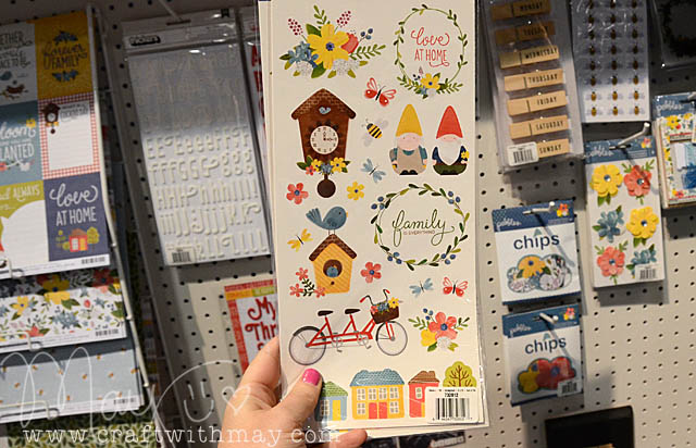
466 copy

“Home Grown” is full of florals sure, but primary colors, gnomes, and mushrooms too! I just loved this one. So cute.
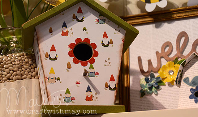
469 copy

As always, Pebbles had a great booth and samples too.
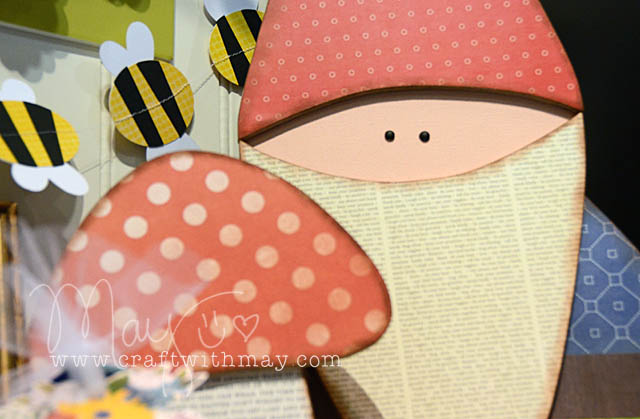
472 copy

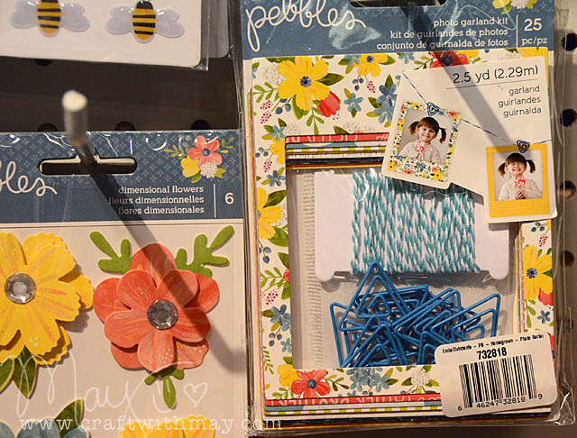
Oh and a “DIY” type crafty but self contained photo garland kit too. I’m really loving the idea of a single product/kit being gifted to a “I’m not crafty” person who can test out our love of all things paper.
473 copy

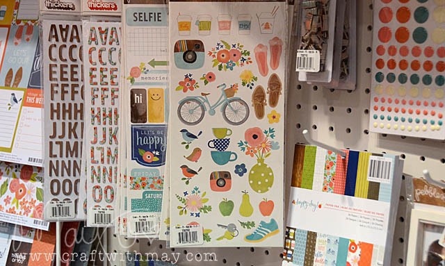
Another line – “Happy Day” reminded me a bit of the garden and other lines from last year. Cute… but I’ll probably pass. Note the instagram type camera and coffee cups – both very hot images to use this show.
474 copy

Then I headed over to Doodlebug not expecting what I found, what made the skies open and angels sing…
1359 copy

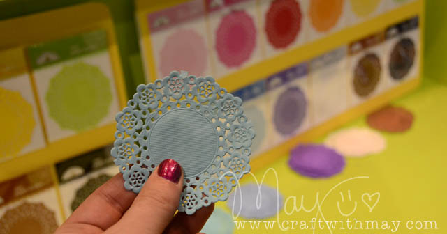
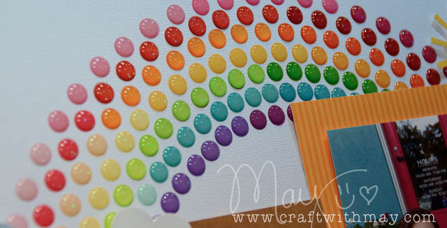
mini. doilies. Look at the scale and look at my hand there. These are SMALL. I’m in love. I want all the colors. Well ok, I do not want brown or black but I want all the others. Speaking of yum – check out the rainbow of glittery enamel goodness…
1363 copy

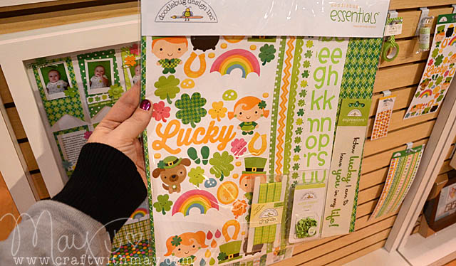
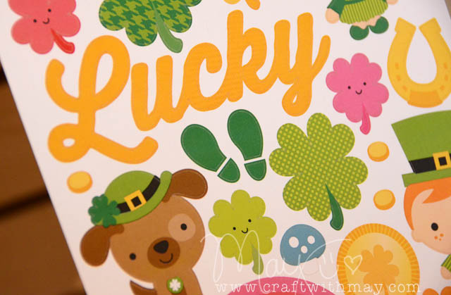
What could be at the end of that rainbow? Why the cutest St. Patrick’s Day line of all time! I adore this – and I love seeing this holiday in a paper line.
1368 copy

Just a few shamrocks and some cute stickers and I’m off…
1372 copy

So both leprechauns and gnomes represented on the show floor – who’d have thought?
new loves | brads

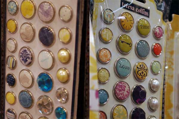
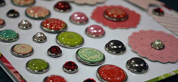
I do love my decorative brads, and CHA made me simply giddy with all the new goodies coming! Above are some fabulous brads from Echo Park – aren’t they lovely? Speaking of Echo Park – Melissa just posted a full booth tour – check it here!

Here are Teresa Collins brads – oh my. Damask + brad?! yes PLEASE. Let’s see some more…

Top to bottom – Rhonna Farrer (MME), Crate Paper, Basic Grey, K & Co (actually not brads, but similar!) and October Afternoon. I can tell my brad stash is going to be replenished, and well! I can not wait for these to be in stores!


new loves | alphabets

I’m back home, and I want to share a lot of my photos and a lot of my favorites from the CHA show. Now – I didn’t photograph EVERY favorite, nor can I share everything I love. So don’t think of my “new loves” series of posts as an all-inclusive list but rather some of my faves….

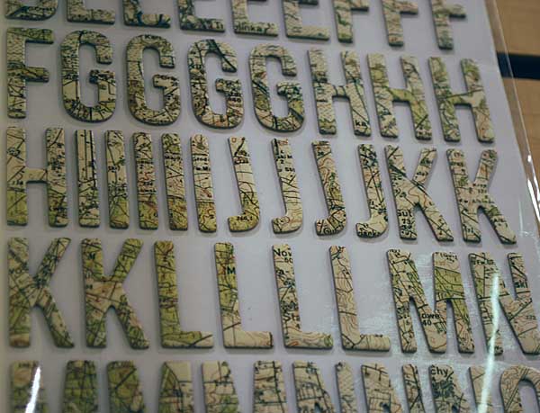
First up – Studio Calico’s map alpha. Every single thing in that booth is MADE OF AWESOME, but I really do adore these. How much fun are they? You could totally ink up the edges too.

Continue reading “new loves | alphabets”

fall project | Trick or Treat layout

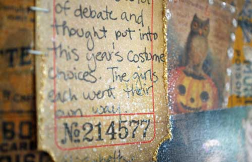
I’ve got a layout [as seen at CHA-Summer in the Tim Holtz Idea-ology booth] to share with you today! I *love* this one, and had so much fun playing with the kraft resist papers…

 All the paper used here is kraft resist + spiced marmalade ink pad EXCEPT the strip across that is un-inked/treated. That shows you what a difference ink makes! Of course, distress stain would be even easier to do this with – I just didn’t have it at the time!

I did use some perfect pearl mist spritzed around here and there to add some droplets of sparkle. LOVE that spray!

Supplies used:

All supplies used on this project can be found at simonsaysstamp.com 

Idea-ology project #1: Santa Goofy

It was an honor and a pleasure to create projects for the CHA show for the always awesome Tim Holtz. He posted a video tour of his products at CHA that shows a lot – though I want to jump in and grab products! SO much fun stuff. Today I’m going to share the first of nine projects I made:

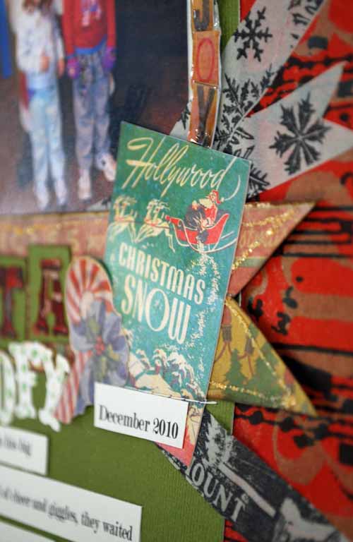
Almost everything used on this page is from Tim Holtz! The core’dinations cardstock (in peeled paint, I believe), from Idea-Ology I used the new Christmas kraft resist for the background (sprayed with red mist), stickers from the seasonal salvage stickers pack, Tidings tissue tape, new kraft resist chipboard letter (“S”), and a bit of the seasonal patterned paper as well. From Sizzix I used the vintage marketplace die (letters), and of course I used distress stickles to accent the page.

Distress stickles make everything just a little better. Seriously LOVE how they add the look of real glitter without the fuss. I dotted some on my “goofy” title, and outlined some elements with it as well.

Printing out my journaling in strips (as I did on this layout) is one of my favorite go-to tricks. It lets me break up what I’ve got to say, and I love the look.

Tissue Tape (another of my obsessions!) finds it’s way onto this layout in several spots. I am really into cutting the ends of my paper (and even tape) into a banner-like look. Just adds a little something extra – and you know I’m all about the details.

I will be posting all of the projects I made for Tim here on my blog, though I might hold a few of these seasonal ones for closer to the holidays – I haven’t yet decided!

Have a beautiful weekend-