double page layout

Who’s ready to kick of the second week of Camp Scrap? Today I’m sharing a layout that I just adore – about my favorite meal experience on the island of Maui. Our final lunch (on the way to the airport) – a great experience at Mama’s fish house.
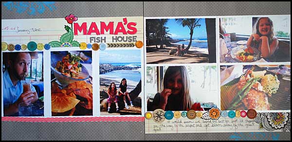
This was one of those layouts that took me weeks to finish. I knew what I wanted to do exactly, I just kept forgetting about it somehow?! I’m not sure what the issue was, but every time I saw the grey paper + photos I thought about how I needed to finish it.
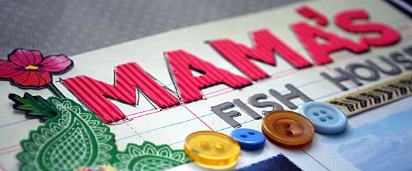
Such a simple page too. Below you can see how I colored a bit on the Sketchbook paper… love that it was just outlined and waiting for me to add my color…
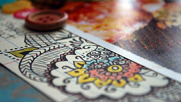
One of my favorite things to do with a double page layout is to keep it simple, and leave a few spots for play/embellishing. On this page, I made that space along the top left and bottom right.
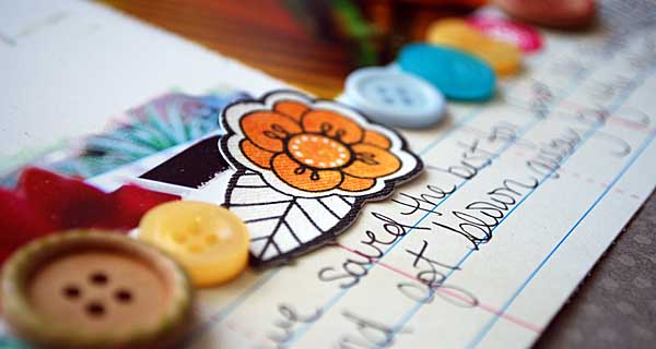
While my version seemed to take me forever to finish (I just kept getting distracted!) this would be a very simple, fast page to put together! The design is very similar to the sketch I shared last week too – now that I really look at it.

Supplies used:


Today’s post is sponsored by Scrapbook Circle
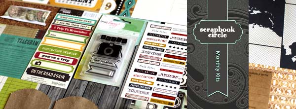
Scrapbook Circle has been creating monthly papercrafting kits for 6 years and have been loving every minute of it. Every kit contains thoughtfully selected paper and embellishments that coordinate perfectly along with a site full of ideas from a talented design team. Not only is each kit filled with the most current products available, each kit includes a custom Scrapbook Circle printable.

The kits are available to anyone without a monthly commitment. If you would like to receive a discount on our kits, then you have the option to sign up for a 2+ month subscription. This option allow you to receive at least two consecutive kits at a discounted price.

Scrapbook Circle is offering 15% off any new order to Camp Scrap participants. Just use promo code MayF15 to receive your discount at checkout. Offer valid through 7/31/12.

 Link to site   *    blog

Camp Scrap week #2

Howdy! I’m back from a 10 day trip via train to Colorado and back, and ready to start week #2 of Camp Scrap! Lots has been going on, and we’re just getting warmed up! I have all kinds of tricks up my sleeve – including tutorials, prizes, and much more. So first, here’s the info for this upcoming week:

Tip: Don’t forget to check for give-aways! If open, you will be able to comment on them. (Once closed, I also close comments). Here is the link to Camp Scrap prize posts: http://mayflaum.com/category/camp-scrap-2012/camp-scrap-2012-prize/

Reminder: if you want to share your projects, chat with others participating, and join in more of the Camp Scrap fun you can join the FREE Big Picture community here: https://www.bigpictureclasses.com/campscrapcommunity.php

Note: if you blog about Camp, I’d love to know! You can leave a comment on the post that inspired you, or email me. In future weeks I’ll be highlighting + linking to bloggers right here in the Sunday bulletin!

in 30 | layout

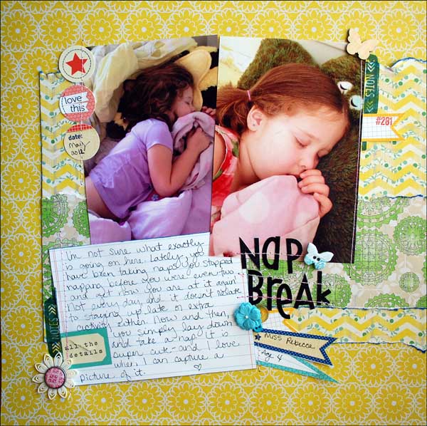
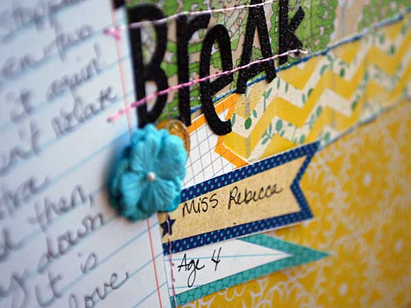
It’s Friday, things are busy, I don’t have time to create! Have you ever said this? Well guess what? You DO have time! We’re going to make time, and I’m here to share a layout that I made with my timer set at 30 minutes.

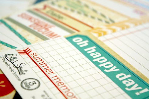
30 minutes doesn’t have to mean simple, boring, or plain. It can be fun just to go, go, go and pull a story together. My inspiration is the new line of Elle’s Studio tags. Oh how I love their tags! So let’s see…

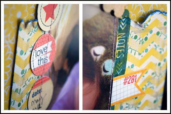
I had a lot of fun with the little bits and pieces (and I’m loving that notes stamp!) and playing with layering up some paper fun.

This is very much a “right now” story, and I love how it all came together. Yellow + green + blue is a fave combination these days. Love the contrast.

Images link to supplies used:

That’s my made in 30 page – what will you make in 30 minutes? Just think – in the length of time it takes to watch a TV show, you could be crafting something…

Let’s get creative!


Today’s post is sponsored by www.shopellesstudio.com

Elle’s Studio has just released some beautiful tags for summer and everyday! With this new launch they also released two fun stamps and a Summer Mini Album Workshop.

There’s lots to see and do at Elle’s studio – their website has just been fully re-designed and they added a member gallery where we can upload our projects and a message board, too! And, if you are ever looking for inspiration, make sure you stop by their blog and facebook page.

LINKS:  Elle’s Studio Shop  *   Summer Lovin’ Mini Album Workshop  *   Blog  *   Facebook

PROMO: Any order over $35 ships for free! Just use CAMPSCRAP during checkout – offer ends August 31st, 2012

tag | textured foil background

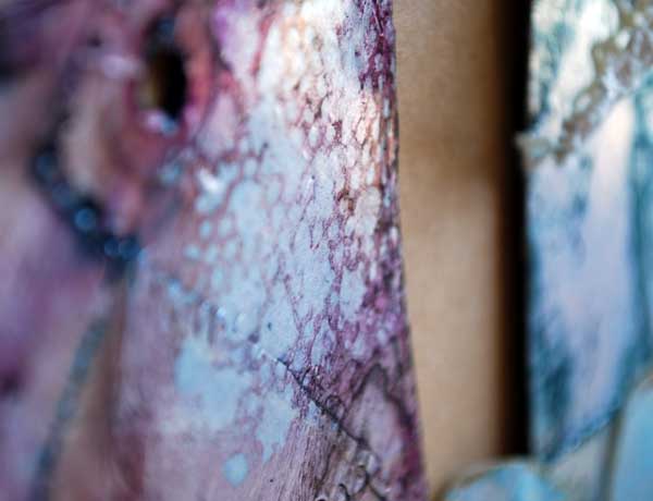
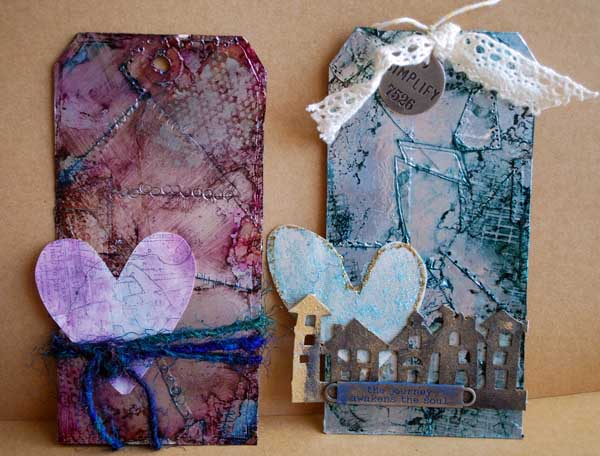
I was dying to know how Tim Holtz did his funky metal background technique – and I was very excited when he taught us how to do it at Ranger U. I was blown away to discover that it was a lot easier than it looked! You’ll need some alcohol inks + ranger sticky-back foil. I think this could also work with acrylic paint, but I’ve not tried that. You’ll also need something to stick the foil to, and some things to make texture.

To really explain, I think a video would be best and so I created this for you:

[link to youtube]

Are you inspired yet? I’ve shown this on tags, but I could see it on a frame, as a die cut embellishment, and so much more!

Perfect if you’re looking for some way to add some funk to more masculine or urban pages, and just – whoa. LOVE! It’d be great off the page too in altered arts.

Supplies shown/used:


Today’s post is sponsored by Blue Moon Scrapbooking.

With new items coming in all the time, fast service, and free shipping (within 48 states of USA) for all orders over $50 – they’re one of my favorite spots to shop! You can find the supplies I used today there, and you can also get a special deal – good only today and tomorrow (June 14-15):

Note:  if you’re spending more… you can get something even bigger! Spend $75.00 receive a Tim Holtz District Market Burlap Panel, or spend $150.00 and receive a Tim Holtz Tote bag! Just don’t forget to type in that special code to take advantage of the special gift with purchase offer.

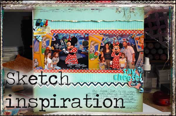
sketch inspiration | card or layout

While I don’t use sketches much anymore, I actually do use them quite a bit.

Wait – what?

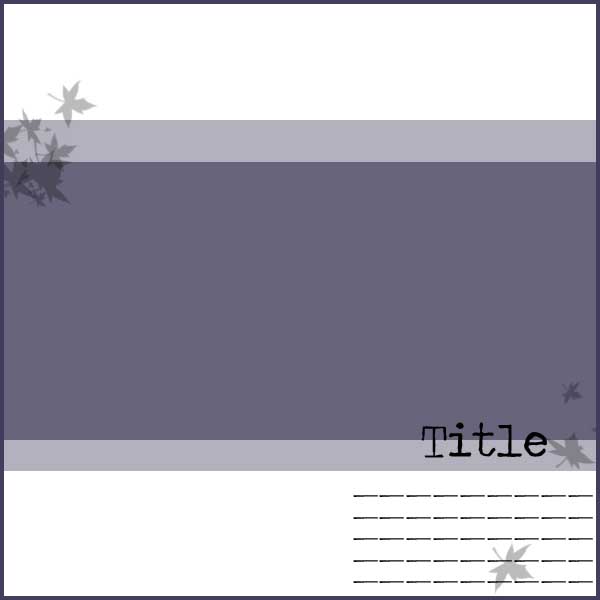
What I mean is, there are basic blueprints in my mind that I know work, that I know I can utilize my 4×6 photos with for scrapbooking and that I can customize for my stories. Today I want to share a favorite sketch with you – and show you how I used it on a card too.

This sketch as you can see has very little to it.

This is because depending on my photos, my papers, and my story I can edit it to make it work for whatever I happen to be working on at the moment.

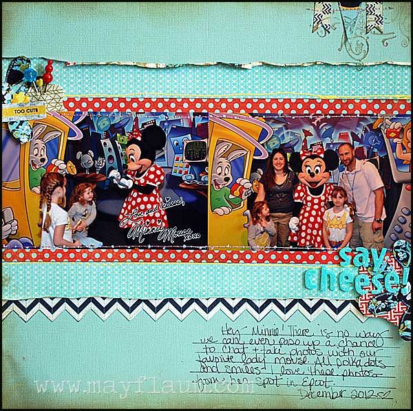
Here I have used this sketch with a ScrapRoom page kit:

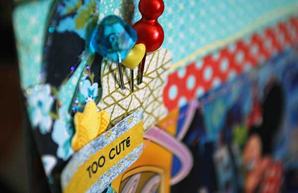
I really like the bite sized kits (perfect inspiration for a page or two!) – and with just added touches I really like how this layered page came out.

Links to supplies used on both projects:

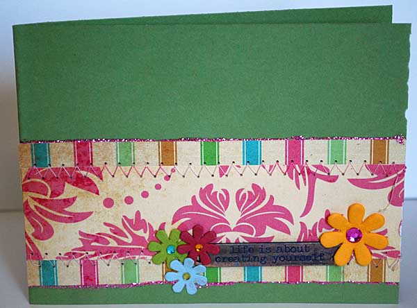
I took a different ScrapRoom page kit and used my sketch inspiration on a card:

I’m super inspired to try and use more of my page sketch designs onto card format – I really like how this one came out!

If you’re inspired to try something with this basic sketch – I hope you’ll share a link with us here, or better yet share it over at the Camp Scrap (FREE) community at Big Picture Classes.

Happy Crafting!


Today’s post is sponsored by the ScrapRoom, and I used their June kits in the above projects. They are generously offering  that if you join The ScrapRoom for the first time and mention “CampScrap” in the comments section of your order to receive a FREE Layout kit in your first shipment!

We do have a Facebook page (The ScrapRoom) and of course, our blog link: http://thescraproomblog.blogspot.com/