I’m sharing another project from CHA created for Tim Holtz…
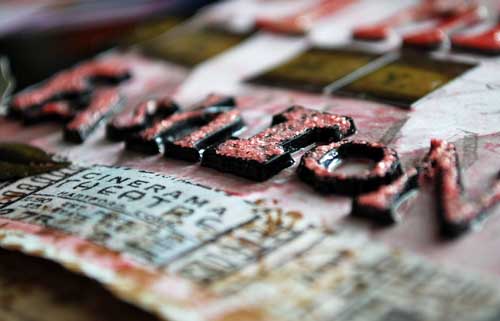
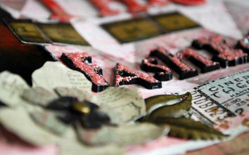
I found that the new black plastic letters can be topped with stickles (shown above). I also coated with Glossy Accents so that it really had a good seal. But truly one of my FAVORITE items had to be the tiny hangers. On this example (below) I folded a piece of cardstock (like a towel) around the bottom bit and inked the edges for a more aged look. I also added one of the new pen nibs – love those too, and the bottom is die-cut with one of Tim’s dies.
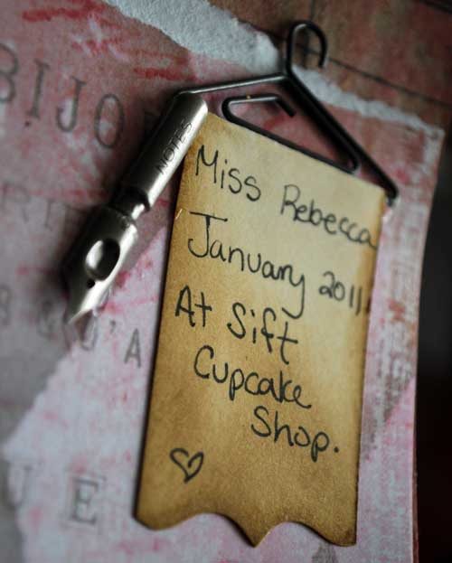
I guess what I’m trying to say, is that this layout was pure, 100% creative play. SO FUN. I decided to try and see if I could work in one of my girliest photos (Miss Becca, in a cupcake shop, wearing her most “fashion” outfit)… and I love the results!
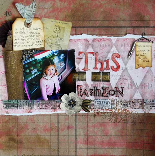
The background is a sheet of the kraft resist paper, and you can see lots of new and older Tim Holtz goodies at work here. The layered flower was created by die-cutting some of the stickers. I’d suggest backing your sticker with cardstock if you’re going to try that at home!
I used one of the kraft glassine envelopes (I used Tim’s texture hammer all over it to get a funky beat up look) to hold my journaling tag. At the top of the tag I used one of the reinforcers (coated with glossy accents & allowed to dry) + some tissue tape at the top of it.
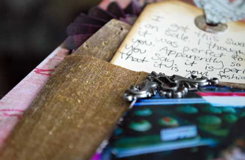
You’ll also see a misted rosette underneath it – it’s actually just a 1/2 of a rosette since I didn’t want it as bulky underneath my journaling where it wouldn’t be seen anyhow.

the letters for “This” are grungeboard topped with distress ink + glossy accents. I use that stuff on everything!!

So there you have it – layout #3 that I made for Tim. So much fun stuff, a lot of which you’ll be seeing in my upcoming in-person classes (once I can get my hands on more!!). If you have questions about the page or anything feel free to ask!
Wonderful job on the layout! I love it!!
love what you did with this lo. I so very badly want those hangers, too cute. I just might break my vow to not purchase any more scrapping stuff. There are so many things of Tim’s that I really would love to have. Fortunately it is not a matter of life and death because we just cannot have everything that we want.
Love this layout!!!
To me (no bs you know how I feel about the subject) this is the perfect layout.Uncontrived and a little bit of treasured “scrap” to dress up a happy memory.
Outstanding layout! I love to see the different spins you put on products!
just gorgeous! Love that tiny little hanger and the story is just so sweet
Great LO! It looks so liberating to me with all of the inking, spraying techniques, it’s the kind of thing that leaves my fingers multicolored and my mood really happy!
I absolutely love this. I really like the way you have used the products – very grungey but also very feminine.I just did one of Tim’s classes over here in the UK and loved it 🙂 It’s great to see that little hanger and also the way you have incorporated the tissue tape too…
Love, love, love that!