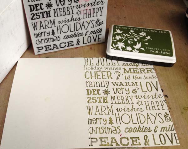
note: this is the first in a new series where I will be creating holiday inspired projects with Hero Arts Stamps. Watch for more over the next few months!

I hear good things about Hero Arts ink pads and I was curious – what was the shadow ink like?
The answer is: rock solid. It is a beautiful ink to stamp with – one that does not blend, fade, or react with water or mist (unlike distress inks) but that is softer than an archival or staz-on type ink. It has a softness to it, and combined with absolutely beautiful colors I know I’ll be getting + using these pads a lot in the future!

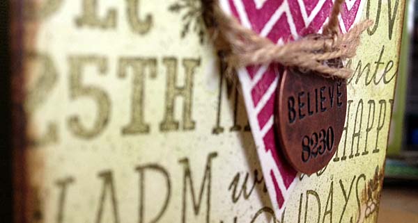
What can you do with them? Stamp with them! I also loved the look when I simply rubbed my ink pad onto a paper – such beautiful coverage. For today though, I made a card featuring two colors, and after stamping my background I used distress ink, mist, and water blended and you can see it did not react. That green ink pad is such a great color!

The heart is also stamped with a new shadow ink color – that’s my very berry favorite. LOVE that rich pink hue. Here’s my finished card:

One holiday card down, many more to go!
Supplies used:


Love that card!
Yes, great card. I need to get started on my Christmas cards.
You’re right these inks are the bomb. I’m going to have tho get that raspberry color.
I need to buy a few colors and try em out! I keep hearing about these inks and think after seeing your card..it will be a worthwhile purchase for upcoming projects and current pages I am working on! Diggin the dark pink color!!! By the way…tried the fish last night…bombdiggity!
Simply beautiful card! I don’t have those inks yet, but after seeing this, I think I need to try them!
The beauty is in the simplicity of this card. Wonderful!
May, this is an extremely helpful review for me — Kristina Werner uses the shadow inks all the time, but I didn’t know why I needed them! This helps me immensely, so thanks!
I’ve tried some softer shades (not mid-tone) and didn’t like the softness on very small and detailed images that I was stamping. I wanted the muted color, but not a fuzzy edge to my image. Maybe I need to try it with a larger image to really appreciate how these inks work. Thanks for sharing and encouraging me to “get back on the horse” and try these inks again!
I love that card! Those inks are really nice.
LOVE this card! Must have stamp! Thanks for sharing! Did you stamp the Christmas “motto” stamp THEN “distress” I really like the lightly distressed look behind the stamp!
Oh, now I have to have that raspberry one! Great card.
Love all the colors these inks come in. Wow!
Beautiful card!!!
Love how you mixed it with the distress.
Ooh, love that rustic look with those great colors.
Love the card May. I’m afraid I’m not so ambitious, although I know people appreciate my handmade cards.
I was watching your Substitution video today in preparation for the Kit-tastic class. I got such a kick out of your stained fingers. Loved watching your hands so much, I almost forgot to listen to your suggestions for substitutions. LOL!!!
Can’t wait til class starts 🙂
Maybe I’ll see you at Big Idea Festival 🙂
Love your card May. ANd I think I have some of those inks somewhere!