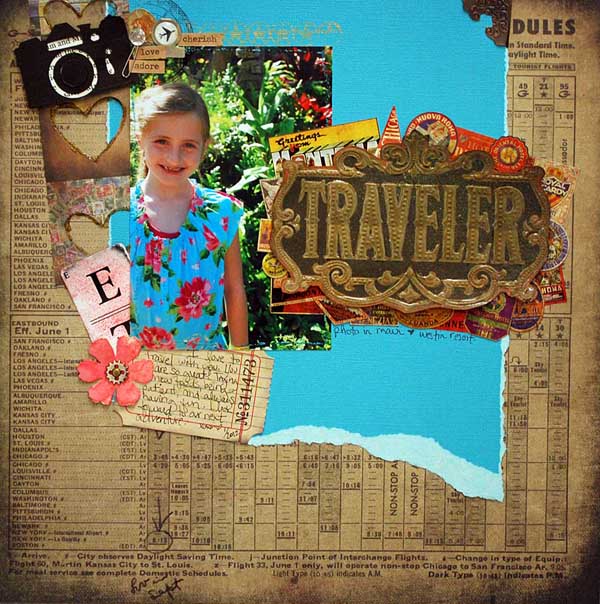
This layout was originally seen at CHA, and features a lot of fantastic Tim Holtz products…

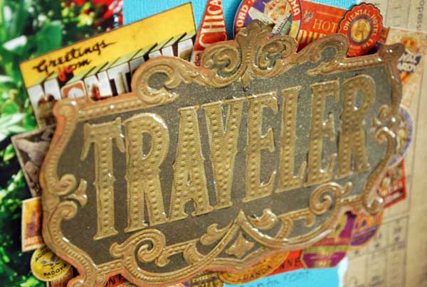
I knew when I first got the Tim Holtz Destinations paper pad that I wanted to cut out this “traveler” sign and use it in some way. I ended up layering all kinds of little stickers under it, and adding glossy accents to the sign to help it pop. There is also a generous misting of Biscotti perfect pearls mist going on too. It really sparkles in person.

If you couldn’t tell – I had a LOT of fun adding bits & pieces and layering things on this one.

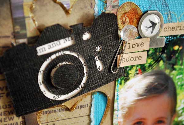
The hearts are actually a scrap of paper left over after I die cut hearts… love using up scraps! That camera die is one I don’t have (I was sent the camera die cut out…) but I am thinking I need to get it asap! LOVE it.

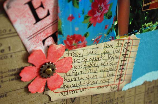
mixing old + new, re-coloring stuff, neutrals + bright colors… overall a totally “may” page. Good times.
links to supplies used:
images link to simon says stamp – a favorite on-line store for Tim Holtz goodies
Cute! Cute! Cute! And yes, you need that camera die………as do I. It really makes the page.
Fantastic page