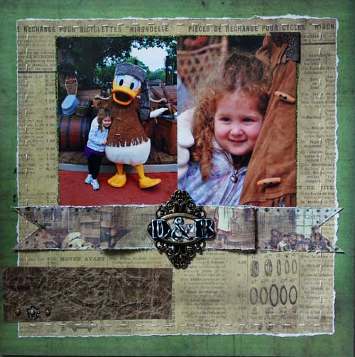
Today I’m sharing a layout I made for Tim Holtz (CHA) – it’s a fairly straightforward one too.

First off – I don’t know what I ever did without Tim’s design ruler. It’s great for tearing (seen on this layout) and also has holes so you can punch measured holes for stitching like I did on this layout.

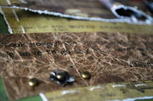
I really wanted to play more with the kraft glassine, so I used these photos of Rebecca meeting ‘Wilderness Donald’ at Disney World. I *love* that kraft glassine so much! I crumpled it, then flattened and taped to paper and printed my journaling onto it. I also accented with stickles, a paper bow, and a few other fun details.

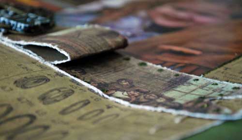
The edges of my paper bow are distressed with Tim’s distress tool.

Another great addition to my Disney World album! Glad to see that book starting to fill up!
Love that page, May! I’ve been looking forward to seeing more of your Disney pages. I’ll be taking DS to Disney soon. I can’t wait to get there!
I love this lo, and it is not just because I am a huge WDW fan. I love that the lo is relatively simple with a few special touches. The glassine paper looks way cool. I am so anxious to be able to purchase it.
I really like this layout! When is that kraft glassine making its appearance? As for the ruler had it in my hands at HL…but couldn’t see how to use! Now I do thanks-:)
That is so cute! And gives me another reason to buy the ruler!!!