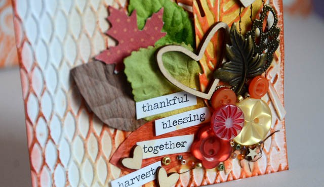
One of my favorite ways to utilize my Tim Holtz texture folders is by making a card – they are the perfect size, after all! Today I’ve got an autumn inspired one – and I’m using (for the first time!) the feather duo that came with both die cuts and the texture folder to make them really have great detail. So impressed!
I added pops of metal, brown, and green in my embellishment cluster to balance out all those lovely shades of persimmon and marmalade.
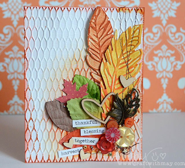
The finished results! I love how this turned out, and the choice to add last minute wood and beads was a good one – this cluster needed that texture pop. Most of the embellishments are older and were found by diving through my lovely tacklebox drawers ‘o buttons and things. Love embellishing this way!
Are you in tried & true cards class yet?! Well This and so many more cards will be featured. You can find all of the info for that class coming in November, as well as my ongoing layouts class craftwithmay.com
Key supplies used:
Any dye ink would work – I used Tim Holtz Distress inks (available pretty much everywhere!), an odd assortment of leaves and wood veneer hearts, a few buttons and beads, and of course my beloved Tim Holtz seasonal chit-chat stickers! The background texture folder and feather die+ texture folder combo that I used are also both Tim Holtz, and available lots of shops – some affiliate links listed below.
Blue Moon Scrapbooking: feather dies/texture duo
Ellen Hutson: Feather Dies/texture and Background texture folder
Scrapbook.com: feather dies/texture
Simon Says Stamp: feather dies/texture and background texture
