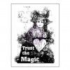
When I get a new artsy stamp, I like to play around with it and figure out how it works best. See how it looks stamped, what colors work well, and what I like.
#1: Plain black archival ink
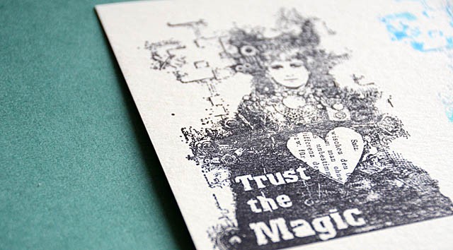
First up, I always try archival ink in black. It’s a good primer for a new stamp and also is really basic. I definitely like how this looks!
#2: various colors of ink
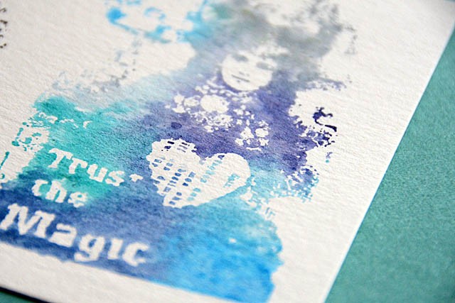
I put a bunch of distress ink colors onto the stamp (I used mini pads directly onto the stamp) and misted it with a bit of water before stamping. The blended watercolor look is cool, but not strong enough to really become a focal point image.
#3: black embossing powder + blended colors
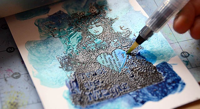
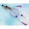
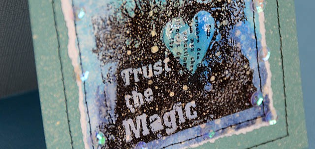
I like parts of the color and parts of the black stamped image, so I stamped + embossed (black powder) the stamp onto specialty stamping paper. Then I rubbed mini distress ink pads directly onto the stamped image. Finally, I blended the colors a bit using a water brush.
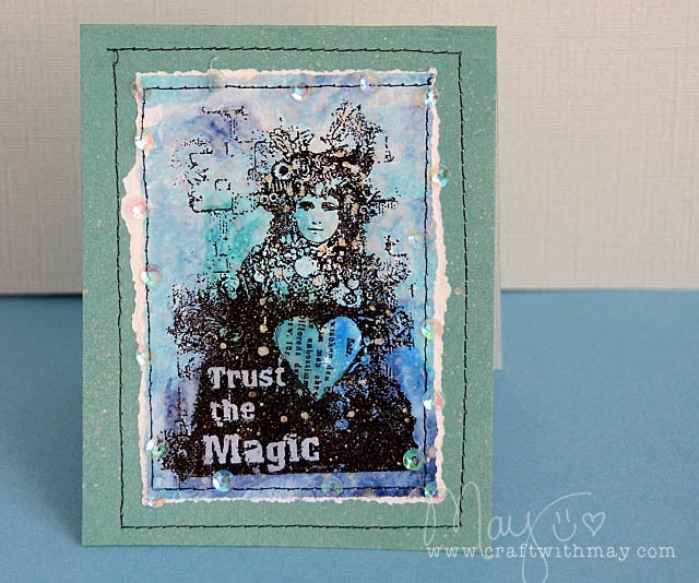
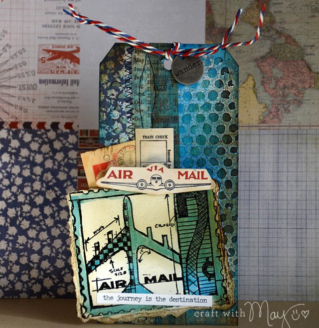
The great part about this? Use a cool stamp and you can just attach it/make it the focal point for a card! I really like how this one came out, and I look forward to playing with this stamp a lot more!
(affiliate links)supplies used:
Simon is offering a generous $50 voucher that will be randomly drawn from the eligible entries each week. Join the fun by creating a project this week – and for your chance to win a $50 voucher you should hop on over and join in the challenge here.
