fall project | costume party

This is another of my ‘as seen at CHA’ projects that I did for Tim Holtz. Have I yet mentioned my LOVE of Tim’s holiday kraft resist papers??? yeah, I love…

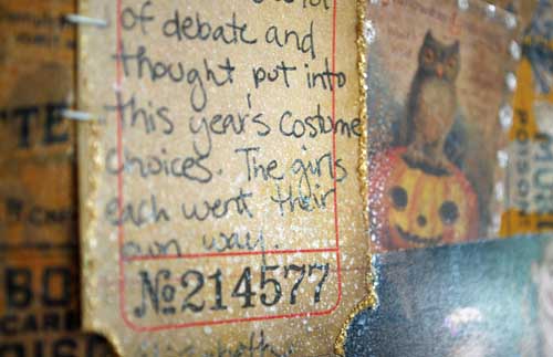
You can see the parts of the background that still look kraft brown – that’s the resist! *such a fan* I also love how the word sheets of paper (where the word ‘costume’ was cut from) can be cut apart and used as accents, titles, and more! I really liked keeping this page simple, as this was my #1 favorite photo from the Mickey’s Halloween Party at Disneyland (CA Adventure park) back in ’09.

Becca as Minnie and Miss E as Snow White… it doesn’t get much better!!

Putting the letters onto the banner die cut (which is a favorite of mine!) and adding all the stickles to give the page a princess flair was my favorite part. LOVE my distress stickles!!

Of course one of the things that makes Tim Holtz products my favorite is COLOR. That I can take his Halloween designs and add so much PINK to make it work for me is fantastic!! It allows me so much creative freedom – love that! Also love how the perfect pearls mist + distress stain allowed me to add sparkle and color to my background! Not to mention the bat I used – love those Halloween metal embellishments!

I wish you a happy Monday!!

fall project | Trick or Treat layout

I’ve got a layout [as seen at CHA-Summer in the Tim Holtz Idea-ology booth] to share with you today! I *love* this one, and had so much fun playing with the kraft resist papers…

 All the paper used here is kraft resist + spiced marmalade ink pad EXCEPT the strip across that is un-inked/treated. That shows you what a difference ink makes! Of course, distress stain would be even easier to do this with – I just didn’t have it at the time!

I did use some perfect pearl mist spritzed around here and there to add some droplets of sparkle. LOVE that spray!

Supplies used:

All supplies used on this project can be found at simonsaysstamp.com 

Idea-ology project #3:

As my little pumpkins get going on their first week of school, I thought it would be great fun to share a layout I created for Tim Holtz (summer CHA) using his idea-ology products that are coming soon…

The metal embellishments? I die. Seriously LOVE them and can’t wait to get my hands on more! They make such a striking layout embellishment. For this page I cut out patterned papers from Tim’s seasonal paper stash, used some new Halloween Kraft resist (LOVE!), got my Spiced Marmalade distress stain going on some kraft resist alphas, and just had a great time.

You can see – I just cut out those Halloween images (LOVE THEM) and worked them in around my photo. I also got some distress stickles (in picket fence, naturally) going on!

Here’s the full layout:

Love how it turned out – and oh do I love those large tags for journaling!!

Best of CHA: Tim Holtz

There is one person noticeably absent from my “best of CHA” series, Mr. Tim Holtz. It was intentional you see – as I am so in love with so much of his product – it needs it’s own post.

 <www.thescrappyjedi.com photo credit>

1. Tim Holtz Distress Stains
There is no other product that I could start this list with! I have been crossing my fingers that Ranger and Tim Holtz would release some more distress stains this show. I have been begging for more any chance I get, and so you can imagine my delight that they released all of them, including a white one called “Picket Fence”.

 <photo from timholtz.com>

I am just dying to get my fingers on each and every one of these. Brushed Corduroy, as my #1 fave distress ink pad color is at the top of the list. But don’t leave out the Mustard seed, Worn Lipstick, Marmalade, Victorian velvet, milled lavender, pumice stone… err… yeah. I want them all.

2. Core’dinations Tim Holtz Kraft-Core “Nostalgic Collection” Cardstock
I chose just one paper for this list, and it had to be the Tim Holtz Kraft-Core Nostalgic Collection cardstock from Core’dinations. Not only does it come in a beautiful palette of colors, but the kraft colored core combines my favorite neutral with my favorite material to start any layout with (cardstock), which makes it a real winner! Core’dinations has a lot of wonderful new product coming out – from new manufacturer-inspired cardstocks to dotted cardstock – but this one is by far my favorite.
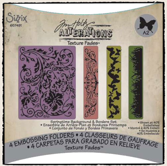
3. Embossing Folders

LOADS of new embossing folders – the one above is my absolute favorite. I can not wait to get that flourish folder and those awesome little ones too… such great texture fade designs from Tim Holtz + Sizzix.
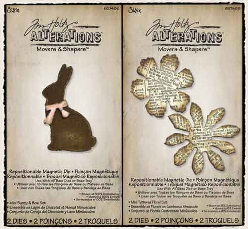
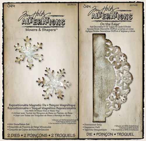
 

4. New Dies

I love the seasonal feel of this batch of new die cuts. The mini ones above? Be still my heart! LOVE! I am also loving the patriotic, christmas, jack-o-lantern faces… oh heck who am I kidding? Love most all of them. But the flowers + bunny I just NEED. Also? The doily edge?! Oh my. OH yes please. The tiny snowflakes will be PERFECT accents on my gift tags this Christmas or as masks for misting or… yeah. I’m feeling the holiday spirit.

5. Seasonal Kraft Resist Paper

I realize this is a LOT of paper – especially for seasonal. But it’s worth it. Why? Because it’s kraft, it’s 100% neutral. You can make it work and color it to work with ANY color palette, therefore it’ll work for this year, next year, five years from now. Timeless stuff. Also this would be GREAT pattern wise for decor, gift tags, bags, and other crafty endeavors that are so popular during the holidays.

6. Trinket case

I had a really cool box similar to this for years and loved it – but this one is even better! In color, design… oh I want to see one of these in person real bad. It’s SO handy to have a container that takes up a smaller space and folds out like this. it’s great for taking to crops, when space on your desk is limited, and so much more. Sign me up!

I am going to stop here, though I could talk for hours about my love of the new stationary line coming, the metal embellishments, the kraft letter stickers, the big pot ‘o rock candy distress crackle paint…

but don’t think I’ll be stopping my posting of projects + ideas with this awesome product!! I’ve got ideas… oh yes I do…

Idea-ology project #2: Post Card

What could be better than playing with the new Kraft Resist Christmas paper from Tim Holtz? How about turning it into a pink & purple Disney World layout! Here’s another CHA project I made for Tim’s booth:

I started by taking the “post card” paper, cutting the section I wanted, and applying Dusty Concord distress stain all over the paper. I then spritzed with Perfect Pearls mist (in perfect pearl) and wiped off the excess moisture on the ‘resist’ parts of the paper. The background of my page is Core’dinations (Distress) cardstock in Milled lavender.

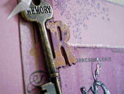
My “R” is one of the new chipboard resist letters – treated with the dusty concord distress stain. The key, flourish stamp, and well everything else on this page is Tim Holtz as well (of course!)

Gotta love my rosette die… I use it so much! Here’s my finished page:

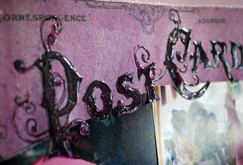
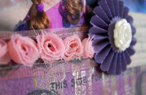
It features my favorite journaling tickets, and I used spun sugar distress stain on the rosette ribbon too. For the title, I put glossy accents over the letters within the patterned paper. Then, when I was ready to place my photos I just used a craft knife to cut the bottoms of the letters out so they could be over my photos. EASY!

I love that I can go totally pink + purple and pure girly with my Tim Holtz supplies as easily as I can greens & browns. The products available let me do so much, and always ahve a great creative time.