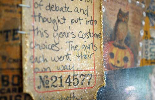
I’ve got a layout [as seen at CHA-Summer in the Tim Holtz Idea-ology booth] to share with you today! I *love* this one, and had so much fun playing with the kraft resist papers…

All the paper used here is kraft resist + spiced marmalade ink pad EXCEPT the strip across that is un-inked/treated. That shows you what a difference ink makes! Of course, distress stain would be even easier to do this with – I just didn’t have it at the time!

I did use some perfect pearl mist spritzed around here and there to add some droplets of sparkle. LOVE that spray!

Supplies used:
All supplies used on this project can be found at simonsaysstamp.com
very cool. great layout; lots of details hidden here and there which really make it work well. perfect pearls is awesome, isn’t it? one question on the purpose of the white ribbon to the right of the spider. is that to draw the eyes to the middle of the page??? thx!
The trick or treat bit is stitched and matted- kinda like a treat bag! The looped ribbon is the top of that. 😉 When layout got put together that bit was already assembled and I left it.
what a great layout, simple looking at first glance until you start really looking at all the cool components! The photos of the girls pop off the page, then you start looking further!
Look the kraft paper and this totally rocks. Love Tim’s stuff just as much!! Keep up the good work.
Always inspired by your work May! I love this layout!
I love love love this layout! The marmalade ink over the paper was such a great idea! The pics are just adorable. TFS and thanx for the inspiration.
I love the marmalade ink on this too. I think that is what really makes the photos pop.
Such a great LO May