When I scrapbook, the process goes photo + story sorted out then I figure out what room is left for embellishing (paper layers, metal bits, buttons, title, etc). Today I am going to share a layout that is the total opposite! Using my ScanNCut (disclaimer, as always that I am a paid consultant for Brother, but all ideas and opinions are my own) I created custom letters which I cut out from paper covered with double sided adhesive… and wow.
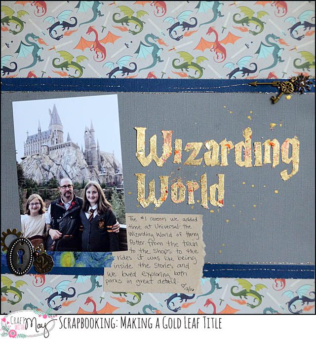
I made a YouTube video to better explain how I made my title. This was a lot of fun to do. Note I used double sided adhesive sheets which had covering still on the side not adhered to cardstock so that I could cut them without any “sticky” situations.
The results were even more fun than I expected!
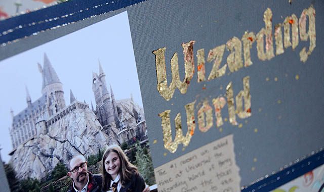
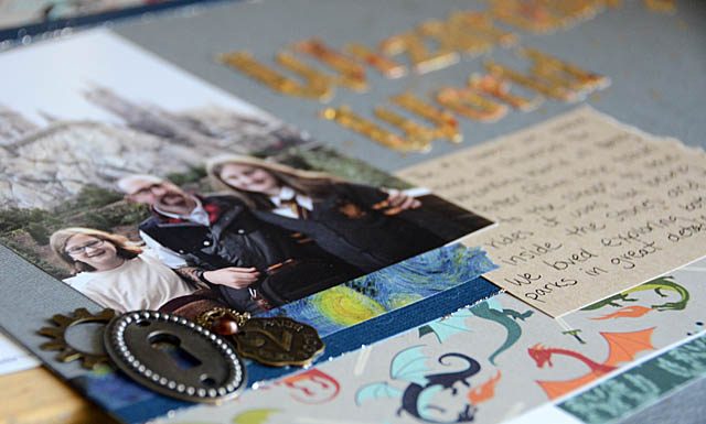
Of course once I had the title done I had to figure out how to make the rest of the page work. I intentionally designed this with just one photo as an introduction to this part of the album. But how to handle the embellishing and even the background paper?
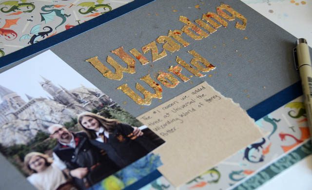
I first added in a simple paper for my journaling, and then I found a perfect dragon covered patterned paper to back the page up. It looked a bit funny so I added thin (1/2″) strips of navy cardstock to help pull things together. With this done I looked for “awkward” spots in the design.
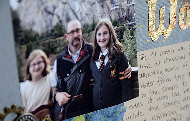
The only one was below the photo I didn’t like the gap, so I filled it! Washi tape and some metal bits and I was really pleased with the results. This kind of a layout isn’t one I usually do, since I normally fit things like titles in after the rest, so it was a fun challenge. The technique I used with double sided adhesive and gold leafing is a fun one – in any shape, design, or text!
One thing is for sure- being able to type up and have a cut file in under a minute here on my laptop that I can then cut from any material I want has been a really cool feature (text converter tool for ScanNCut) that has me scrapbooking more with my machine. Mixing up my creative process and testing new ideas? Icing on the cake!
You inspire me to do more scrapbook pages. My sons are grown, but I do have grandchildren (2+ 1 on the way). This Scan & Cut looks like a handy “tool” to have in a crafters arsenal.
I used the glitter flakes you sent to me for the first time yesterday, funny you should post this today.
I think, I will try it with a title too!
I love the variation in color you get with the gold leafing, it looks so cool. I am tempted to buy some of that gold leafing now, because I really really like how your title turned out. Great layout! Thanks May!
How serendipitous that you had dragon paper at hand for this page! The fancy gold title really makes the page, but the photo is really good, too.
So cool!
Love that dragon paper!!! the title is just beautiful…i want to do this with a small sculpture or something….
This is really cool! From the metal pieces to the title and the background paper, this is truly awesome. Michelle t
May I love that dragon paper. I have a ton of Harry Potter photos thanks for the inspiration!!!
What an impressive title! Love the entire look of this page. Great how-to video. Thanks, may!
That really turned out cool
My daughter just loves this layout. We are heading to Universal in Fl in February for this very trip. I will have to keep this layout in mind for when we get back.
Love the title. It looks amazing in gold
Learning how to really use my scan-n-cut is in my top 5’s for the year. Meant to order new mats last night-will do that right now. it has been my nemesis for years-time for me to conquer it.
Your title looks great! I also added gold to a title recently – and know exactly what you mean by it looking even better than you expected it to.
Love the lettering and the gold leaf! Awesome effect!
The gold title is fantastic! The page looks “magical”!
I normally try to fit the title in after I’ve set up the layout. Case in pint yesterday when I didn’t leave enough room to add in my title in its allotted space!
That looks so good May! I love that you did the title first – especially on a page like this! Love how your daughter is dressed too!
Gold leaf always seems so intimidating to me. Thanks for taking us through the steps.
The lettering turned out fabulous! Perfect for a Harry Potter layout!
OMG I never knew what to do with this stuff! Thank you May! I may need to play with this!
Used gold leaf years ago, but haven’t lately. Love how the letters turned out. May have to give it a whirl again.
I’m like Judy, I’ve seen the gold leafing in the bottles, but didn’t know how to use it. Now I know!
I just got some gold, bronze and silver leading at a recent CK Convention. So much fun to play with. I will have to try a title next.
I like the way this came together!
I love this page. I am so tempted to buy the ScanNCut, but I have SO may tools that just sit collecting dust, I don’t want to add another one to the big pile collecting dust.