One of my favorite things to do with the ScanNCut is to cut out a shape from a tag and use everything but the shape I cut out. What do I mean? I will show you today in this full tutorial! I prefer to do this with my ScanNCut machine – it makes it so quick and easy!
Supplies needed: ScanNCut, manila tags (2), dye ink, gold paint, gold and green mist, background stamps, ribbon, leaves and buttons (or other embellishments), word stickers (or handwrite/type your own)

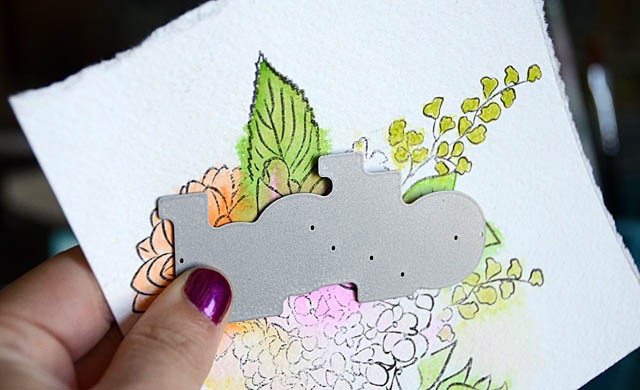
The first step is to figure out what image you want to use. At first I thought this intricate doily image was a good idea. Ah but there is a problem! The design would simply cut a semi-circle out of my tag leaving a lovely border that looked more like someone bit my tag than the beautiful image it was. So- that’s not the image I want for this project.
One of my favorite features of this machine is that I can scan the cutting mat (with paper on it) so that I can see exactly what I’m getting into. It is going to be light (my tag is a light color, after all, but clear enough so that I can view and place my image over the tag and get a feel for what it will look like. Love that!
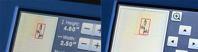
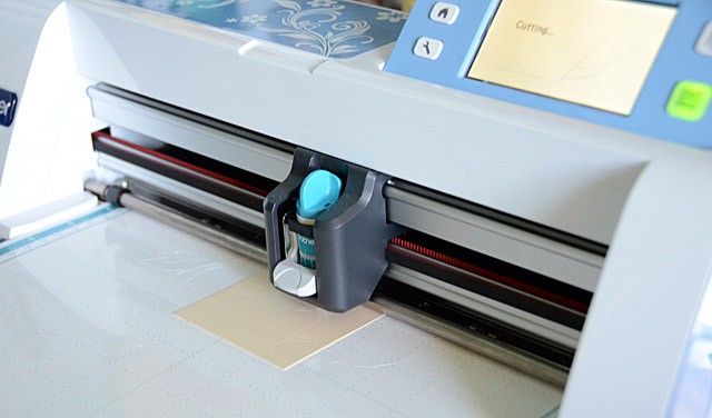
After selecting a botanical image I adjusted the height and the position -both things I can do while seeing the image on top of my tag which is so great- no guessing what it will look like! Once satisfied there’s only one thing to do: let the machine cut!
Now that the technical part is done, it’s time for inky fun!
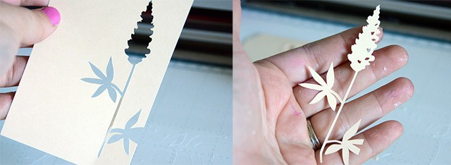
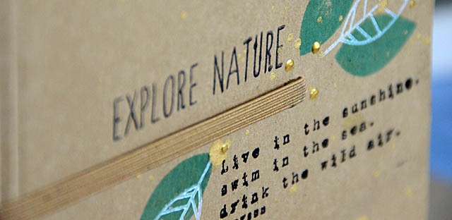
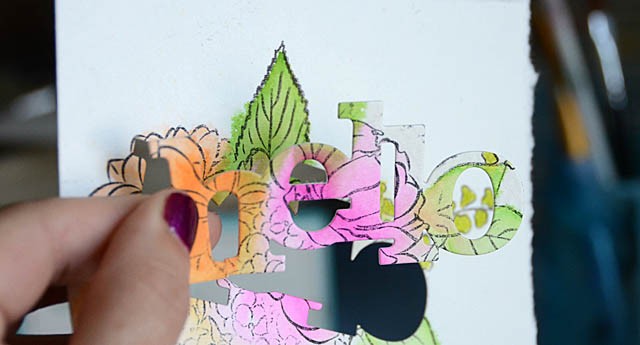
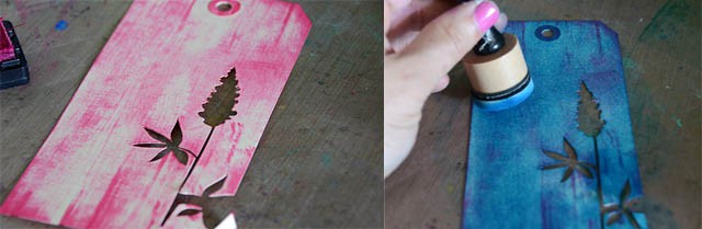
Above you can see the image and the tag left behind. We’ll be focusing on the tag today. First, I placed the image down onto the tag and lightly inked with pink ink. I love this shadow/masking effect!
I felt like going more bold though – and also heading purple instead of pink. How to accomplish this? I first ran my pink ink pad over the image, and then I took a foam tool and blended a rich blue over the top! The result is that all the pink ink turned lovely shades of purple.
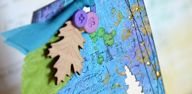
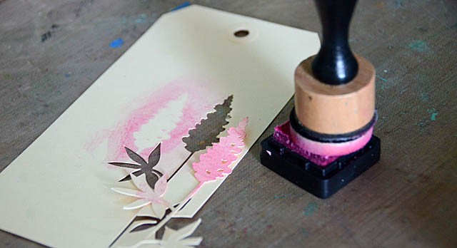
Next up, to add some texture I applied gold paint to a background stamp.
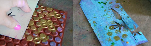
For this kind of project I like to leave the stamp on my table, and press the tag onto the stamp. This tag is pretty delicate around all those intricate cuts – so this lets me press it down with the best results.
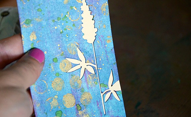
I love the look of a nice dot stamp then combined with a few splatters of mist! I let the random nature of mist act as a way to add to the funky factor of my tag – and I’m loving it! Now that the background is rich and lovely, there’s just a few more things to do. First back the tag with manila cardstock or a cardstock of your choice. I waited until now because I didn’t want to ink up that clean paper. I love the contrast!
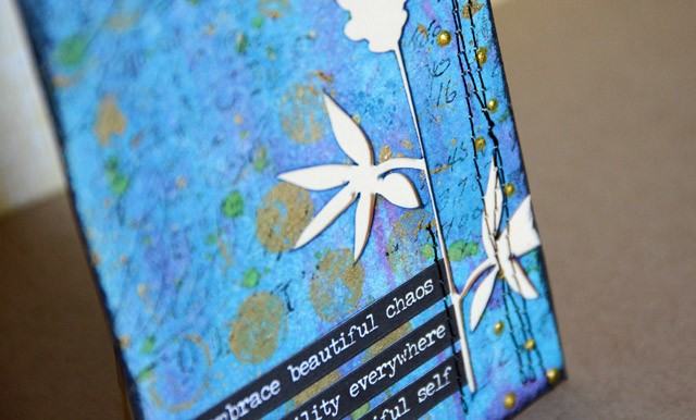
To add even more contrast, I added a few more touches listed below. Here’s my finished project:
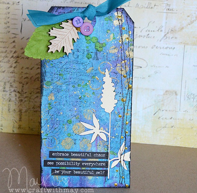
Finishing touches:
- use black ink to stamp the script stamp
- add black ink to edges of tag for contrast
- add stitching along one side, and where phrase stickers are applied
- add gold dimensional paint in dots along stitching
- top tag with a few embellishments and trim
I have so much making tags like these – in fact I’m going to be doing ten background/technique tags with full video tutorials in my upcoming Camp Scrap class on my site! I can never get enough of how my ScanNCut makes getting one of these fun inky creations started- and I hope you’ve enjoyed this tutorial!
Disclosure: I am a paid consultant for Brother International Corporation and have received a ScanNCut from Brother to evaluate. However, the opinions expressed are entirely my own and based on my use of the product.