This post is going to be a big one – Basic Grey has FIVE new lines!
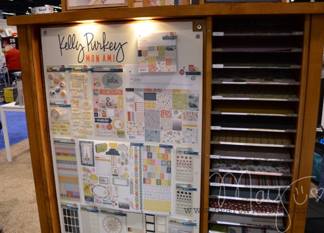
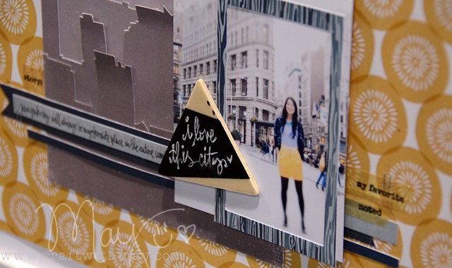
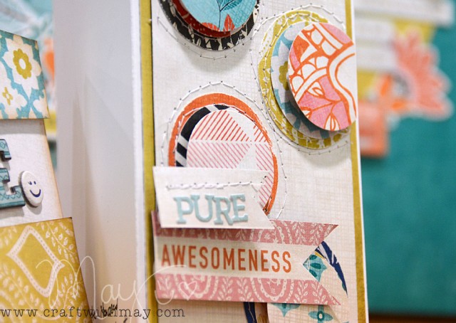
First up – let’s talk about Kelly Purkey’s Mon Ami collection.
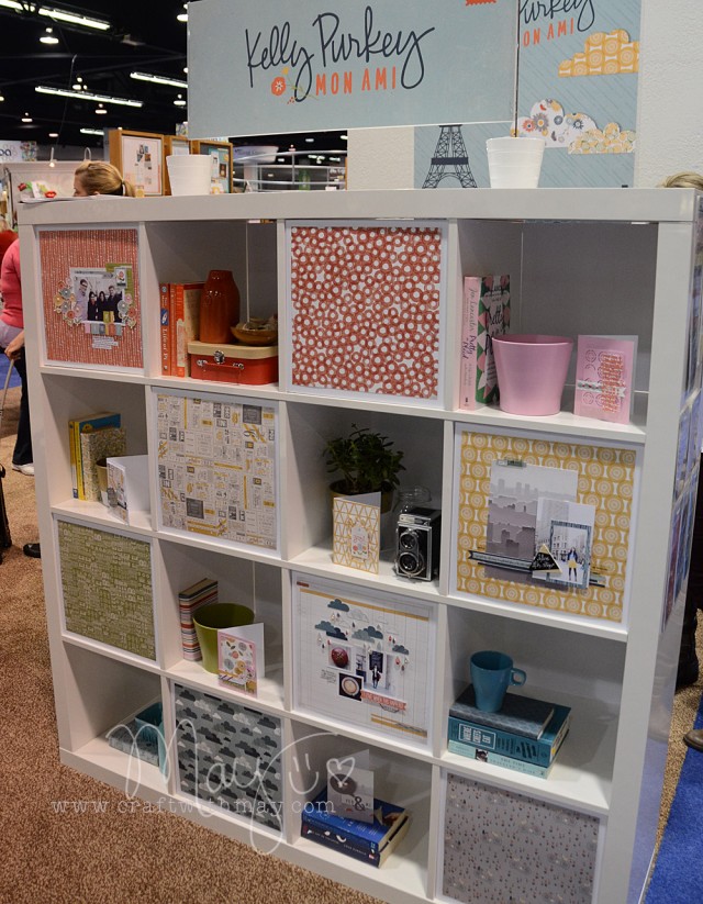
What I like about this one is that it combines the playfulness and design esthetic that I associate with Kelly, while also still feeling very much like a Basic Grey line.
This mustard-y yellow/orange is intriguing me. I think I could work for my pages and I’m eager to try it out.
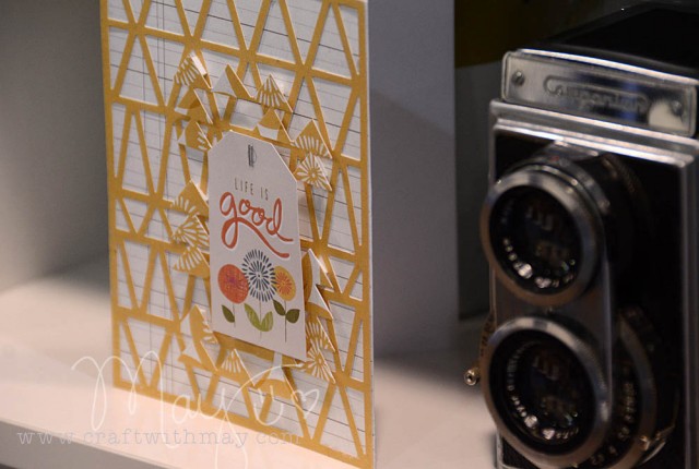
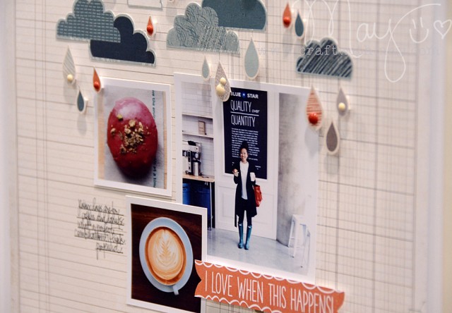
There are a lot of colors and patterns that feel very “Kelly” to me, and what I really love is that this is a versatile line that will work for just about anything.
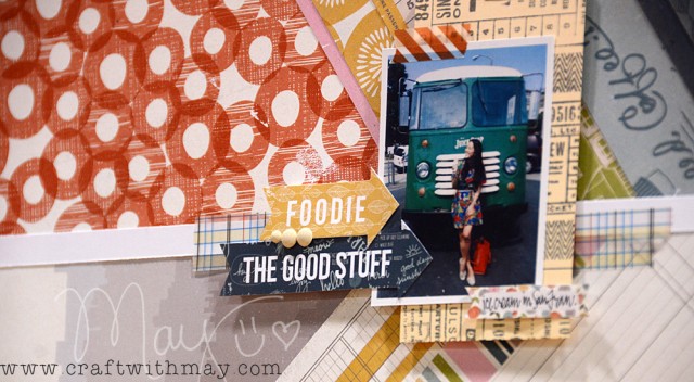
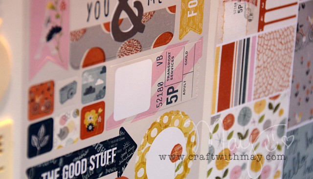
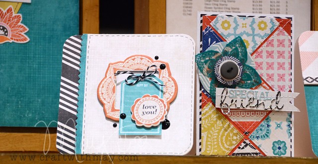
The sticker sheet and tape strips are my two favorite items from this collection (you can see both below)
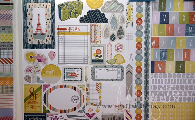
Here’s another sticker sheet I love – check out that VIP ticket.
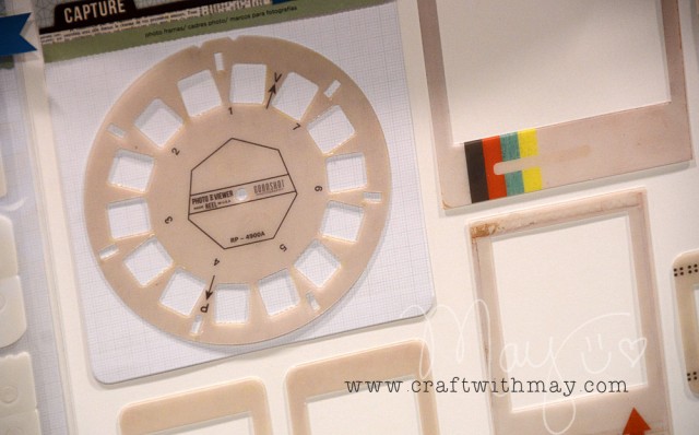
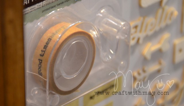
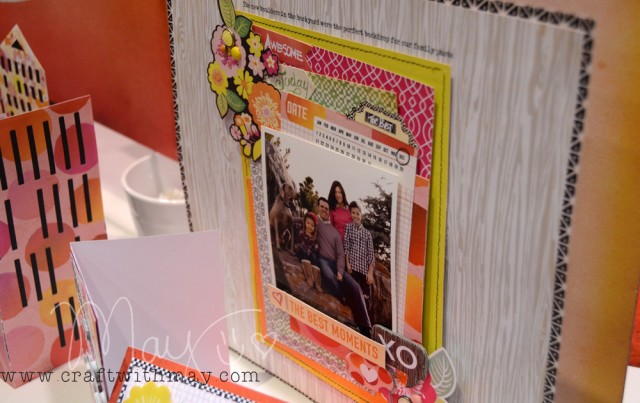
Next up, let’s talk “Capture”. The capture line of products (the way I see them, at least) are designed for use with their binders and mini-books. Often their regular lines have items labeled “Capture” letting you know that they will work with the book system.
At this show, they still have capture-friendly elements in their lines but they also have some capture-specific products as well.
I am a fan of this line – I feel like it offers something for people who want to do memory keeping in a faster/smaller format. But I also think that it opens up possibilities for all kinds of creating.
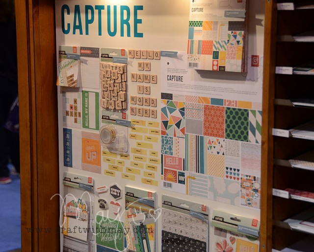
The tape, the wood letters, the colors – I’m really liking how useful these items all look.
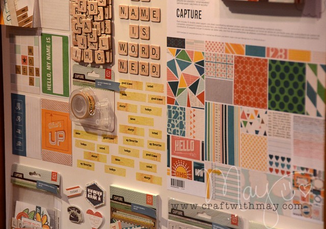
Maybe not the most exciting release I’ve ever seen, but honestly “exciting” doesn’t always mean “most used/loved in actual creating” and I like to keep that in mind when looking.
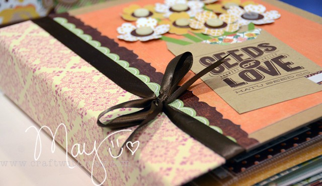
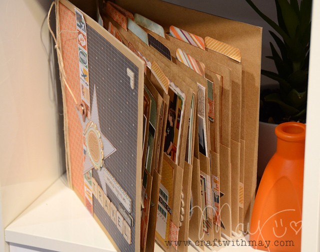
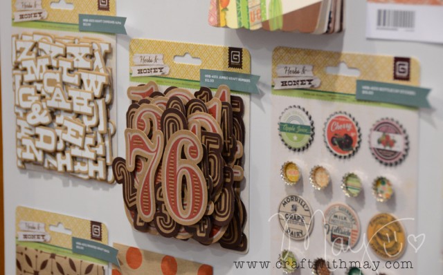
Next up, my favorite line Herbs & Honey.
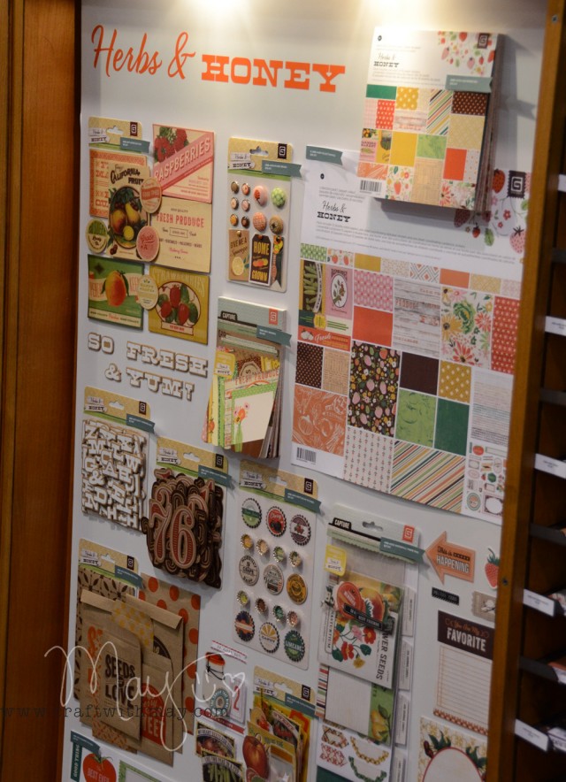
This line has such a vintage feel and yet I think that it would work well for more modern themes as well.
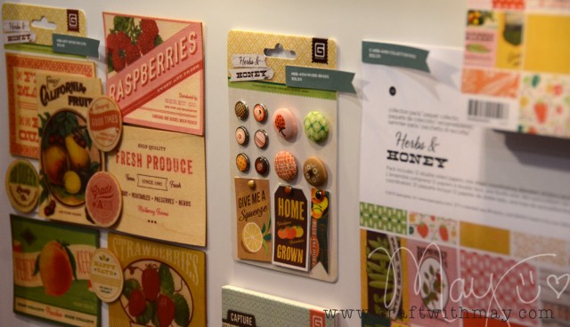
The brads & bottlecap embellishments? Must haves!
I sure love all the kraft in this line.
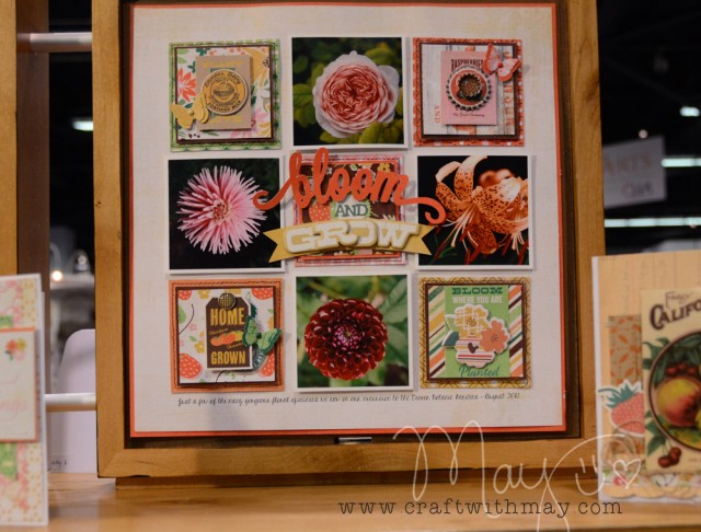
As you can see from my booth photos – they went all out with fantastic displays and sample projects.
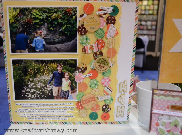
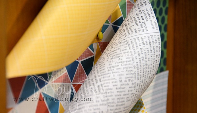
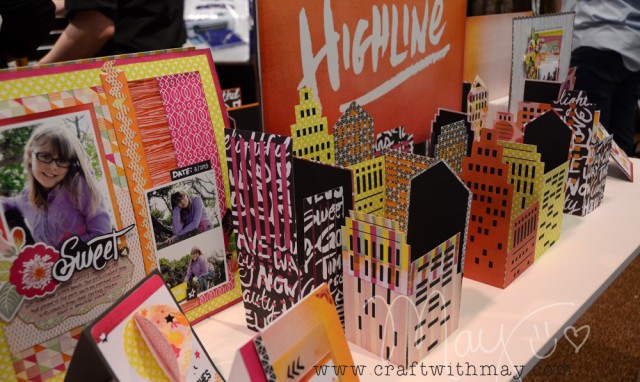
Speaking of samples and projects – let’s peek at Highline!
This line is so bright and bold. I think this is going to be a line that you either absolutely NEED, or that doesn’t work for you at all.
I’m a bit concerned about all that bold orange and black – those aren’t my colors at all and so while I think this line is really cool I don’t think you’ll see me do much with it.
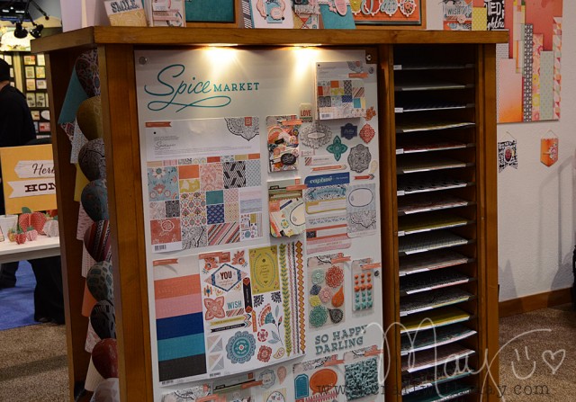
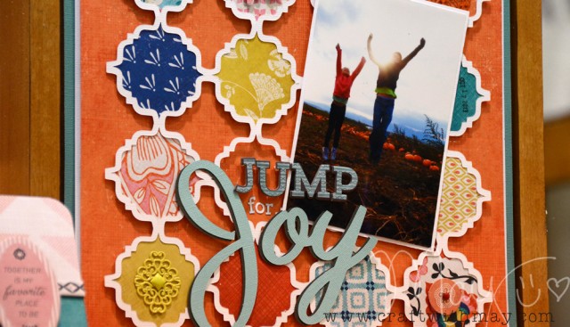
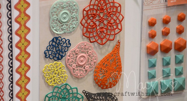
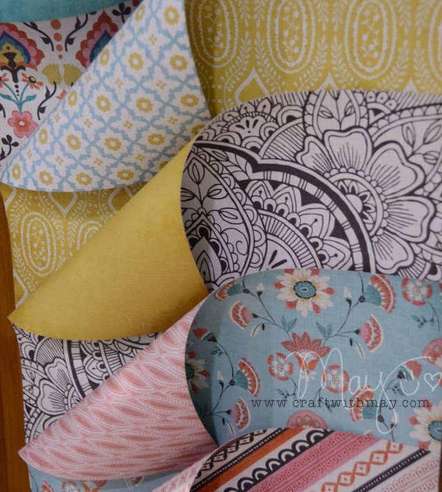
A line that also features orange, but that I do think I will be using loads is Spice Market.
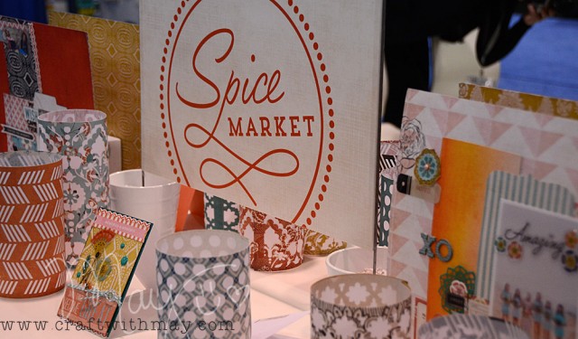
The tile patterns, metal accents, and rich colors look like they would be great fun to scrapbook with.
Blue + Orange wouldn’t seem like a “May” combination but for scrapbooking it really is.
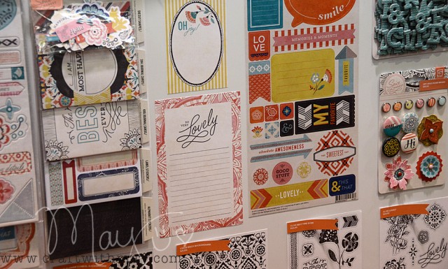
more samples- seriously just such beautiful stuff! Loving the detail and so much patterned paper used!
Here’s a peek at the waterfall pack and brads – two of my must-haves from this line.
And that wraps up my Basic Grey CHA post! Now I have oh, maybe 100 more photos of the booth but as I just got home, would like to get some sleep, and didn’t want to delay sharing I think these give you a good feel for what is coming. The lines will ship (at different times) over the next few months and you’ll see more looks at Basic Grey in my trends articles and favorite products posts coming here to my blog soon.
Right now though – it’s good to be back in my own home and you can look forward to many, many, MANY posts going up over the next week or so!
You’ve been pinned LOL.
Love this stuff. As a professed paper junkie I would be in heaven. Thanks for all the cool photos. Michelle t
Very cool stuff! I love the Herbs and Honey the best! Great colors and I need those scrabble tiles. I know that lots of people love bright colors but Highline would be really hard for me to work with. I’m more into earthy and vintage.
Thank you for the photos and descriptions. Love this post and can’t wait to see others as you get to them. My favorite from these BG lines is Spice Market. Orange is not a favorite color of mine, but combined with blue, totally love it.
Great post, May. I agree with you about the color orange…not too much for me..but with the blues, really great! I really am liking the embellishments, though, from BG.
I can’t wait to see Mon Ami, Capture and Spice Market!
On another note, thank you so much for your stencil class. I’m really enjoying it!
Loving how we were at the same show, in the same booths, and how we both zoomed in on different things. I almost feel like I’m seeing things again for the first time!