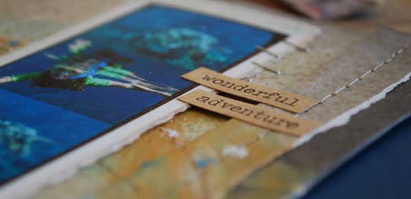
This is the first layout I created upon returning from Hawaii. Created the morning after our return actually – and for the always amazing Mr. Tim Holtz (for display at CHA). Today I wanted to share it because it is a perfect example of how I let my photos + story lead the way.
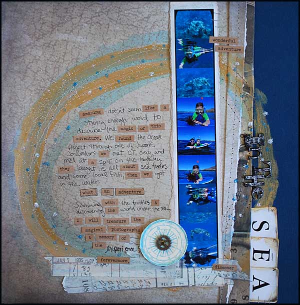
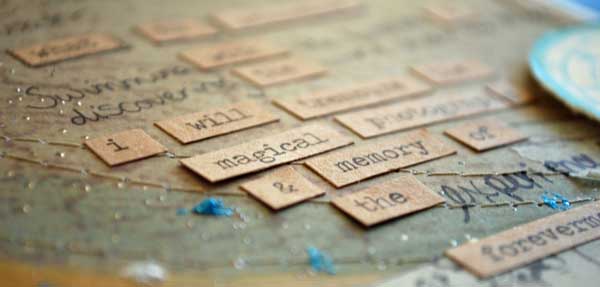
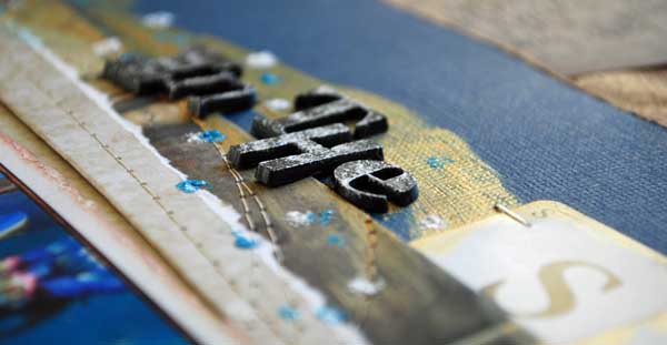
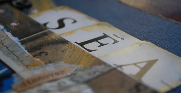
With so much to say about the AMAZING experience that was learning + snorkeling with the Ocean Project in Maui and swimming along side Sea Turtles, these word stickers were perfect to help tell some of my story. The photos sent to us from the experience were very small files, not suitable to print large at all as I normally do. Rather than have super grainy, virtually unrecognizable pixelated photos I just printed off in a strip as seen above.
I wanted lots of journaling space, that I knew. I also wanted some kind of a circle tying it all together and swirling around. I went with it. Added more layers as needed. At the end (you can see it above) I sprinkled UTEE in platinum on my project and heated from underneath to get metallic sparkly little dots.
One of the cornerstone elements of my personal style is that I let my key inspirational element (story, photos, etc) be my guide. This means that sometimes a page will have more product, other times less technique. While that might at first glance not seem consistent, it actually is very much so. Because I let the ideas flow from a place that is real, true, pure. I do my best to keep it that way and not think about what someone else would do, or all the possible ways I could be doing something. I just roll with what feels right.
Sometimes I think that one of the reasons I’m considered a “fast” crafter is just this. When I’m making something I fully focus on it, I’m thinking about my story that I’m telling through words and photos – but also paper and embellishments. I make sure I like what I’m doing and while it doesn’t always turned out as I had hoped, I have a real good time. ALWAYS. There is a reason I’m always saying “Happy Crafting!” I really mean it. I live by it.
I will be sharing the rest of my projects that I created for Tim (for CHA) over the next month or so as well. This one, as the first one I made and a very special one for me as well, just needed to be first. One note before I go – the first 4 items listed in my supplies used below are the new products, and they will be out soon. The links I’ve provided go to Simon Says Stamp – where you can pre-order them. I *LOVE* that I can pre-order so many things from them.
Supplies Used:
two Tim notes of extraordinary interest:
- Tim has his first ever on-line class. SO EXCITED! You can check it out at www.onlinecardclasses.com – it starts March 19
- Tim’s new book is shipping SOON! In fact – you can order an autographed copy directly from him. http://www.timholtz.com/book2.htm
Visually stunning page.
Such a beautifier page. Love the way it flows and those pics are gorgeous! TFS and for enabling 😉
gorgeous, of course! I love the circular painting 🙂
Beautiful!
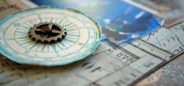
Just love that LO May. Fantastic journaling and I really like how you used the word stickers in there. I bought a set of Tim Holtz travel stamps today which have that compass – can’t wait to use them!
WOW, May this page is beautiful, love the design and the feel of it, so different. Such an inspiration.