Last month we went on our biggest family vacation ever, to Disney World. This year (as in, 2011) one of my goals is to save some of the photos & use them for ‘blog exclusive’ layouts right here. I’ll take pictures of my process, share tips, thoughts, etc. So watch for more “Vacation layouts” posts in future!

First up today: the curse of the characters. Whether you are some place where you’re actually taking photos with characters, you’ve got a lot of clashing people in photos, or just have a lot of vivid (but again, not ‘matching’ ) color in your photos these tips can work for you!
Tip #1: Make a cardstock base that is fairly neutral. DO NOT GET PATTERNED PAPER OUT if you have more than 1 photo!!
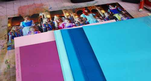
I like cardstock a lot anyhow, but it’s especially important here if you are planning a multi-photo layout. Why? Well if you’re already working with a lot of busy photos, you do NOT want to be adding any more busy-ness to the page. We can add the funk & spunk later. Start SIMPLE. Above you can see me trying to decide what color (I didn’t want a neutral, rather a base cool color…) to use.
I found this sheet of Core’dinations SPARKLE cardstock (oh be still my heart. PERFECT!)
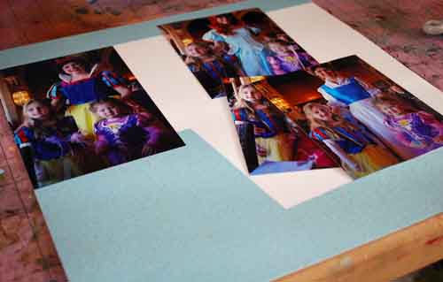
Tip #2: If using a special paper that you don’t have more of, think about cutting out where your photos will be so that you’ve got some saved! See above – I used white cardstock as base on this layout.
So I trimmed up the height of my photos – the Snow White remained 4×6, the others cropped somewhere between 4 1/2 – 5″ high. Then I fit them across the page.
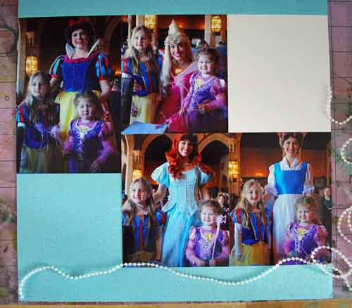
I’m not going to lie to you – at this point I got a real bad feeling about this page. I was THIS CLOSE to pulling off my photos & doing something entirely different. But I decided to try a few more things and see if I could work it out.
tip #3: Set up your photos, background paper, and figure out where/what journaling and title will be BEFORE you touch embellishments. This way, if you wind up with a real ugly page you can pull the photos off & start over with minimal cost/damage.
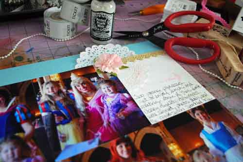
At this point I knew I had to do SOMETHING about how linear it was. I added in one of my trusty doilies, a sprayed pink Prima Flower, some Webster’s Pages golden trim, a CatsLife Press “once upon a time” stamp, Tim Holtz flourish stamp, and my journaling. The top corner, in my mind, was salvaged. What about the bottom?
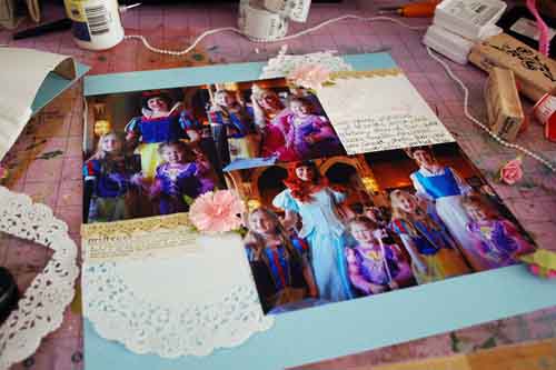
I grit my teeth, and by golly I think I’ve almost got it. I used my CatsLife Press “princess” stamp (that I’d bought just before this vacation and was determined to use!!), a larger doily, and another sprayed flower.
Tip #4: Contrast is your friend. Got super bright photo subjects? Use muted colors on your page. Dark pictures? Go with lighter embellishments and papers. The key is contrast friends, and if you feel like your page is lacking something try adding something super light or dark to add some pop.

In a final “by golly I WILL use some of these dang theme stickers!!” I used up some Sleeping Beauty Stickers. Love the 3 fairies (and the added prima roses) in here.
Tip #5: Using theme product? Use it sparingly and make sure it’s got a place on your page.
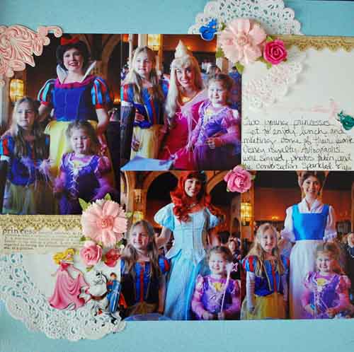
Know what? I really like how this turned out! You can’t see it too well, but the cardstock sparkles and glimmers beautifully, and I have the extra pieces saved for the other princess (Cinderella) meet & greet layout in case I want them. I hope you enjoyed a look into my creative process.
Loved your walk through of this. I’m always afraid to use ‘theme’ product so this was great! Such a pretty layout! 🙂
May — I really like how this LO developed. Very good use of the photos and spacing. PLUS: your girls will LOVE it!!
The pictures are darling and the gold trim makes them pop!!
I like the step by step approach. I always leave journalling and title until last so I want to try out this idea!
** Kate **
Gorgeous! I loved seeing how it came together step by step, and you found a great way to use themed product.
Love layout & seeing your creative process. Look forward to seeing more of these in the future.
May, we went to Disney World in 2006, and the pictures from the Princess Lunch were the hardest to scrap! Bright clashing colors & very dark backgrounds. But the smile on my daughter’s face lit them up! Yours are beautiful!
Love how you used those embellishments!
cute 😀
gotta love the disney pics 😉
xo
i don’t think i’ve really seen theme stickers used in a way that i find agreeable… until now. i love this enough that i might even try them one day! :]
Love this LO! I think I have those stickers and now I know how to use them. Another winner, May!
that is such a great page May! I appreciate the time you’re taking to do this walk through
Love this! I really liked seeing how you did this step by step! Thanks for writing your thoughts out in detail!
That turned out beautiful May! I love it!