I was looking over the PDF files for Double Take (my new class with Nic Howard), and wow. Ok, so I always LOVE seeing my raw materials turned into the formatted/edited look of the Big Picture files and such… but this time was DOUBLE as cool because I got to see more images of all Nic’s layouts, read her notes, and wow… I hope you’re joining us for class because this is going to be 32 layouts worth of fun…

Above is the opening page of our week #1 PDF file. Inside each week’s handout you’ll find 4 sketches, 8 layouts (2 for each sketch), Q&A about common double page questions, tips, hints, notes on how we utilized the other person’s sketch, and more. I REALLY love this class format. Seeing how Nic used my sketches is so inspiring – seeing how she made them her own, what twists she added – love it.

I also loved putting my mark on Nic’s sketches! Above is a peek at one of my layouts from class based on a Nic sketch. She tends to have bigger journaling blocks + more layers of paper than me. Yet with each sketch I made sure to keep it “me” and put my own twist on them. So fun. The layout above you can see I broke my journaling up into sentences (vs one big block) that lets it keep the same look but in my own way.

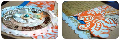
Here’s more peeks! This is another layout based on a Nic sketch. This one took me forever – I had major brain block. But I worked through it (and I share my “how” in class!) and I made some super fun layered embellishments and such for this page. It’s one of my favorites of the whole class!! Especially the colors. Kraft + orange + blue. LOVING that combo!
To read more about class + register check it all out here: http://www.bigpictureclasses.com/doubletake.php
I hope to see you in class! if you have questions or anything feel free to ask here or email me.