What could be better than playing with the new Kraft Resist Christmas paper from Tim Holtz? How about turning it into a pink & purple Disney World layout! Here’s another CHA project I made for Tim’s booth:

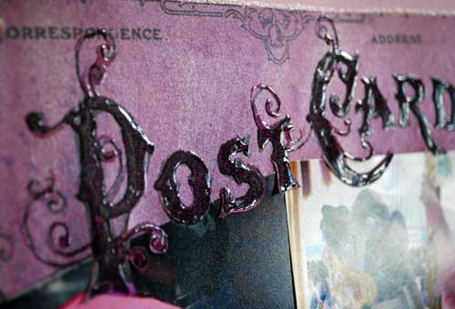
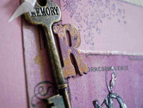
I started by taking the “post card” paper, cutting the section I wanted, and applying Dusty Concord distress stain all over the paper. I then spritzed with Perfect Pearls mist (in perfect pearl) and wiped off the excess moisture on the ‘resist’ parts of the paper. The background of my page is Core’dinations (Distress) cardstock in Milled lavender.

My “R” is one of the new chipboard resist letters – treated with the dusty concord distress stain. The key, flourish stamp, and well everything else on this page is Tim Holtz as well (of course!)

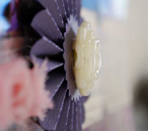
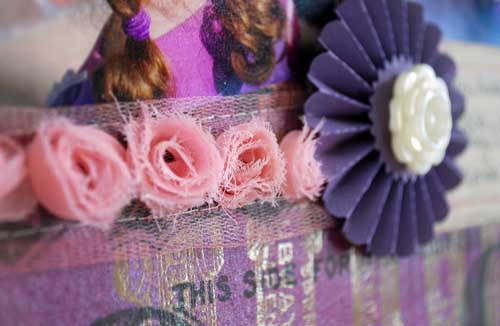
Gotta love my rosette die… I use it so much! Here’s my finished page:

It features my favorite journaling tickets, and I used spun sugar distress stain on the rosette ribbon too. For the title, I put glossy accents over the letters within the patterned paper. Then, when I was ready to place my photos I just used a craft knife to cut the bottoms of the letters out so they could be over my photos. EASY!

I love that I can go totally pink + purple and pure girly with my Tim Holtz supplies as easily as I can greens & browns. The products available let me do so much, and always ahve a great creative time.
Beautiful- I love the girly colours 🙂
Too too cute – I love that rosette die too
Love it!!!!!!!!!
Amazing that you can use these products and transform them into a Disney design! Bravo! Lots of gorgeous details 🙂
LOVE what you did with this layout!!
I missed this post but am delighted to have found it even if a couple of days late. Love what you created.