I first heard of Core’dinations from Stacy Julian, when we were discussing the project now (cardstock) class she was giving me the green light on. I was excited and intrigued – after all the concept of cardstock with a lighter color core (so you can sand or tear away to reveal) sounded good to me. Like thick buttery frosting inside a cake of paper goodness if you know what I mean.

You’ve got to head over to www.coredinations.com to check out all their goodness. I have a wish list going right now, but first I’m working on using up the lovelies I have right here in-house. Would you like to see a layout I just made?

First of all – Mindy (from Core’dinations) taught me that you can put a piece of chipboard under the paper, sand, and this is what happens. The outline shows up that pale color. (swoon) SO love this technique! I also love that if I cover chipboard with it I get a painted/distressed edge very easily without ink or paint – I’ve got core color! I also learned something new this morning…

I drew “bliss” on the back (backwards) and when I held it up to my desk light I could SEE IT. So I was able to make adjustments & get my title just right before cutting out. I thank the light core for that – and I’m very excited to use this again and again!! (note you can see that light color on the torn edge. Cool, no?) Not to be a tease here- but if you’re in my cardstock class at Big Picture then you know how I make hand-drawn titles like this. Students, know that I continue to do them & love them. CARDSTOCK ROCKS!

Just rubbing lightly on the punched hearts made them look like I’d smudged pale paint on them – I so love distressing.

Don’t even get me started on the whitewash & vintage collections. I use those as much as I can! I love how I could fold & crumple & tear this green strip and make it look all broken in & faded. love.
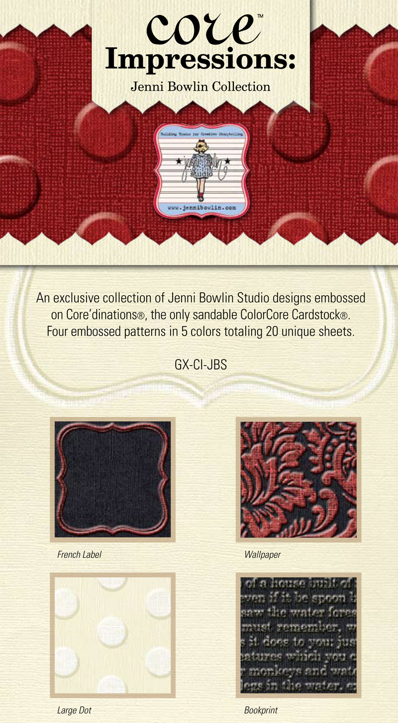
Finally I’ve got to share this. At the top of my “oh please, oh I so need this” is this:

I haven’t found it anywhere… and I need it. (sigh)
In the meantime I’ll be heading back to the bat cave to create more with cardstock and make a dusty mess of myself. It’s too fun not to!
I haven’t seen the Jenni Bowlin paper! How cool! I do, however, love my coredinations papers.
Oh my gosh … that Jenni Bowlin line is TO DIE FOR! I need some!!
I love the Coredinations paper and have a few sets of it myself. Yes I will be desiring the Jenni Bowlin papers also!!!
I’ve not yet tried this cardstock ! But your love of it is contagious !
Oh May I am in love! You are very successful in spreading the love! Jen Bowlin……….omg!!!
Love the Jenni Bowlin collection. My LSS carries the Core’dinations by the sheet and some packs.
Have you seen the black collections – Black Magic???
back during the n50 trainings, i used some of this with those texture plates. i always used that swirly design (hopefully you know which one i’m talking about) which nearly killed my arm by the time i was done embossing it onto the paper with the stylus thing. anyway. then i would sand it and get that awesome effect. it became hard to find for a while, but i hear that joann’s has it now, so i might have to look into that because you are right… this stuff if fun!
when bazzill came out with dotted swiss cardstock, i was seriously hoping for a white core so that i could sand it and get the cool effect. not the case though. so that jenni bowlin coredinations with the big dots is calling my name for sure. can you even imagine how many times a person could use that one!?
I just used my first piece (lime green!) of this cardstock this week…LOVE it. Love that I can actually find it in stores now! It’s just to die for…
This cardstock is so cool. I’m going to have to go shopping. Thanks for sharing!!
Love the chipboard technique! Thanks May
I have some texture templates….lay over the paper, rub on it with the tool, voila texture….they are very cool with this paper. And that Jenni Bowlin….really need to find that.
I just got a variety of coordinations. It’s fun to play with. I’m not positve but I think I saw the Jennie Bowlin papers at Debby’s dream studio.Check out Debby’s Dare, (Fiskateer Debby Lewis), & hop there from there.
I just wanted to share that I made your chicken recipe for dinner last night. It was great!! Thanks for sharing.
Oh, that embossed CS is gorgeous! I need some too!
May this is wonderful I love the pictures thank you so much for sharing!
cutcardstock.com has the Jenni Bowlin papers!