When I was at the Simon Says Create event a few weeks back two things struck me as “need to do this more”.
- Do ombre and coloring effects on die cuts
- Create more intricate backgrounds
I combined these two to create my tag for this week’s challenge.
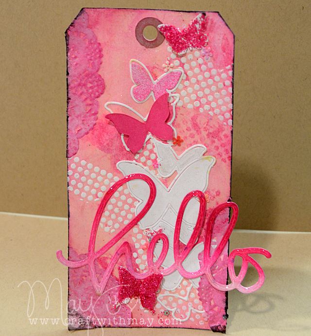
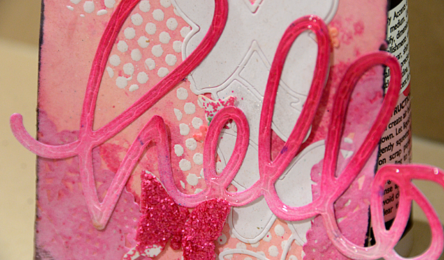
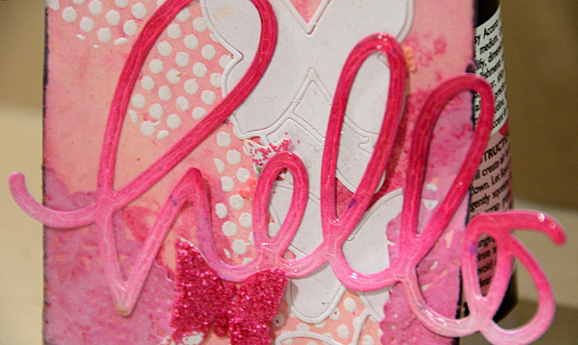
To do the ombre effect it is quite simple. Use ANY dye ink. apply to foam blending tool. tap onto die cut. Always start at the same end/spot and only do this a little bit on one end, a lot at the other. Instant ombre!
For my tag, I also coated my “hello” in glossy accents for shine and dimension.
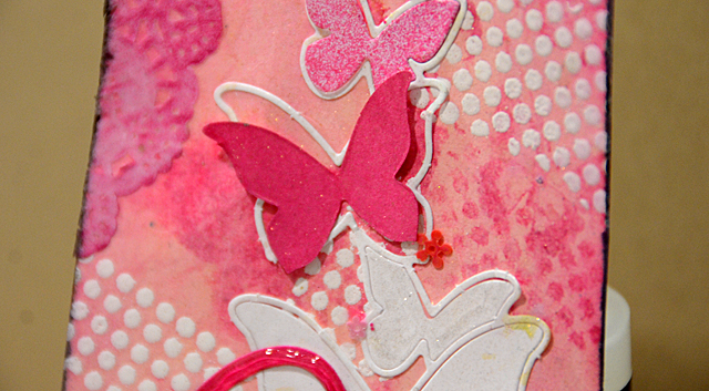
The background you may recognize – I did something very similar a while back for the yellow challenge. I sure do love playing with butterflies.
Supplies Used:
 |
 |
 |
 |
 |
|
 |
 |
 What will inspire you this week? Join in the creative fun! Simon is, as always, offering a generous $50 voucher that will be randomly drawn from the eligible entries each week. Join the fun by creating a project this week – and for your chance to win a $50 voucher you should hop on over and join in the challenge here.
Beautiful tag, so very pretty. I love the pink and the butterflies are lovely. Michelle t
Fabulous Pretty in Pink! Love the gradient effect on your tag! Lovely!
I really like your tag May, it’s beautiful. I’d love to see a video on how you went about creating it.
Love the beautiful colors and those butterflies are gorgeous! Such a wonderful design. 🙂
you have a way w/colors that blow me away; I enjoy every project you share w/the world!!
Stunning pink tag, May! Love the big hello with the glossy finish of glossy accents! Hugs, Sandra
pretty tag!
UH-Mazing! Love that one pink butterfly popping out!
Pretty in pink! Love the butterflies 🙂
*mwah*
Steph
Simon Says Stamp!
OMG May that is just GORGEOUS!!
This is seriously, awesomely pretty and I am not a pink girl AT.ALL. Thanks for explaining the ombre and how to get it, sounds simple, but I didn’t know and was trying the hard way with different color inks, etc. As always … May to the rescue! Love your blog.
YES … that would be great!
Hi May… I love your tag because it is PINK, has polka dots which I adore with pink… and has butterflies and all in all is a pretty tag… love it all… Thanks for all the PINK… Love, Light and Peace..Bonnie
MAy what a beautiful creation! Love the Glossy idea on the die!!! BArbarayaya
May! I adore how this tag turned out! The color palette is so alive with energy and that ombre effect worked beautifully! I also really liked how you incorporated the butterflies and how some of them are “hollow” while others are filled in with white. Your projects always have such great elements and you know so many incredible techniques!
Beautiful tag May! The ombre ‘hello’ looks fantastic!
When I first saw this I thought for sure that would say that you should use pink more, because you rocked it! I love the ombré. Beautiful.
This is such a beautiful tag, May! I love the ombre look that you’ve created on the wording and the background is stunning. I love it… 🙂