One thing I’m loving abut the Heidi Swapp product line is that it can be super funky and layered and technique filled… or it can be really simple. I can just tell a story, and use some of the products to compliment my story and photos.

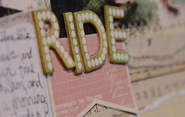
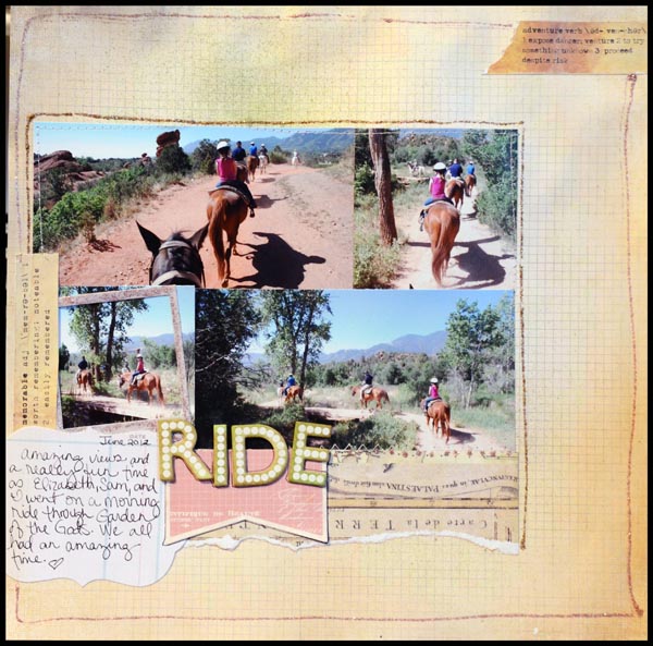
On this page, I did mist the title letters (gotta love that customization!) and the rest, was even simpler. A little mist on the background, a bit of distress stickles to accent.

Photos are 3×6 and 3 x 2 1/2, and all the product (except distress stickles) is Heidi Swapp. Here are links to the supplies I used:

Now that you’ve seen a simple page, my next step will be kicking it up a few notches- and I’ll have a video to share as well. I’ve got a mind full of ideas, and a lot more still to share…


Love this page!
My LSS got this product line in last week and I purchased a ton of it. LOVE it!
Lovely layout 🙂
C x
I love the stickle borders. Great layout!
You go girlie!!! Love the new Heidi Swapp releases!!!! Enjoying this week of posts:)
This is great! My LSS needs to get this line in.