She brings all kinds of good things into my life including craft supply enabling, TV, creative feedback, and even new to me websites. She’s even better in person than she is on-line [which I thought was impossible!], and we share so many things in common… while being totally different too. I’m talking about Melissa Stinson, and she’s… well I’ll let her take it away…
Good morning, everyone! My name is Melissa Stinson (also known as Scrappy Jedi, or if you like you can simply refer to me as “not May”), and I’m taking over May’s blog for just a bit this morning. She’s been doing a fantastic job of keeping everyone inspired with Camp Scrap, and I thought I’d give her a break today and bring you a little inspiration of my own, as well as a tip or two from taking inspiration from nearly any layout- even if the style of the project is totally not yours.

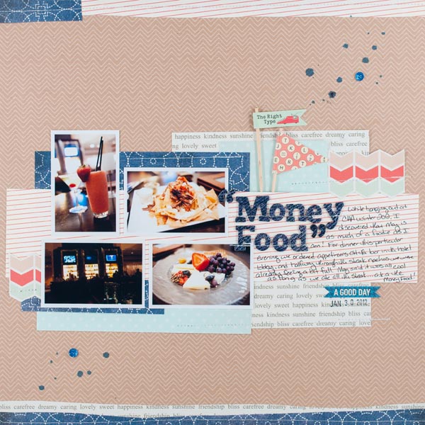
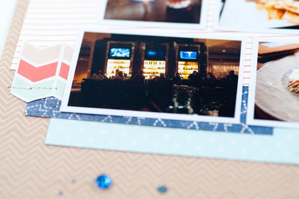
May and I have a lot of things in common- we like a lot of the same food (in fact, these photos were taken during one of our foodie adventures at the CHA Winter 2012 show), we get inspired by many of the same things, and most of the time we even like the same scrapbooking supplies. What you may notice from the layout above, though, is that we have quite a few differences in our scrapbooking styles. May is fabulously artsy and amazing with inks, paints, and all kinds of messy mediums, and she adds so many details to all of her pages- more than I could even dream up (ummm, I’m kind of in love with how she used gold ink on the edge of the journaling card on this layout), much less execute them as well as she does. She also scraps almost exclusively with 4×6 photos and really fills her pages, while I tend to like smaller pictures and lots of white space.

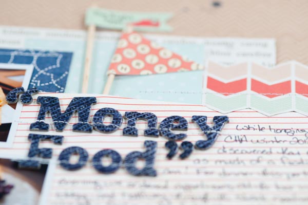
For today’s layout, I took that idea of common supplies and different styles and ran with it. May and I both loved Studio Calico’s July kit, Elmwood Park (you can see what she did with the kit here, here, and here), so when it was time for me to select supplies for this project, it was a natural choice to help illustrate what two very different scrappers can do with the same supplies. You can see the elements of my own style in my page- May tears her papers a lot while I have all hand and trimmer cut pieces. May does lots of penwork and detail, especially around her title, while I tend to let the Thickers (or whatever alpha stickers I’m using at the time) stand on their own.
But you know what? I still get inspired by nearly every single layout that May makes, even though we have such different styles. I may take just one thing that she did on a project and incorporate it into my cleaner and simpler style. I might take the general idea of her photo and paper placement, but shrink the sizes down to fit my white-space-loving tendencies. And sometimes I’ll just gaze at the loveliness and let it soak into the whole general mish-mash of creative stuff that gets compiled from every pretty thing that I see and take in from all kinds of different sources. It all works for me, and it all inspires me.

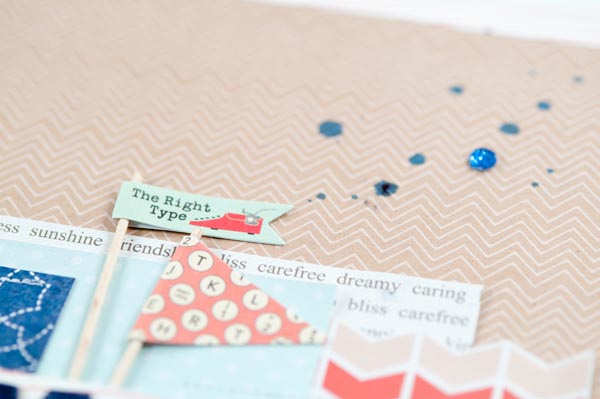
And one of the things that I learned from May that was incorporated straight into my own style? The mist splatters! I learned the technique from a video in one of her previous Big Picture classes- Creative Retreat- and I’d say it’s something that I use on every third layout (or more) now. I’ve also picked up a lot from her on the importance of story on a page as well as letting the photo take center stage, but in a way that still leaves plenty of room for creative play.

So, thank you, May, for inspiring me every day. And thank you for letting me hijack your blog today!

I love this layout! Absolutely fabulous!!
Very dynamic duo: May & Melissa. My style is also very clean and graphic, more like Melissa’s but I take inspiration from every single one of May’s freestyle layouts. Great tag team teaching.
Wonderful layout. I’m going to have to try those mist splatters – they look great.
Seeing the same materials in different styles is wonderful. I think I fall somewhere in between them. Love clean and gritty side by side sometimes. Thanks for this terrific view and of course now I want to go back and get that kit too, LOL.
Great layout! Love the mist splatters! Would you share the technique? Pretty pleease 🙂
I could be wrong – but I believe she literally just splatters like I do! Just take the squirter top out of the mist, and flick!! 🙂
Love your layout!
Yup, May is right! I unscrew the top from the mist and flick the little tube thingy underneath at the paper to create the splatters. So easy!
Just love all the layouts I see on Mays blog!!! Ty Melissa for a different style, love it too!
Great LO