Happy Wednesday everyone! Today I want you to just get out some coordinating paper, and play!
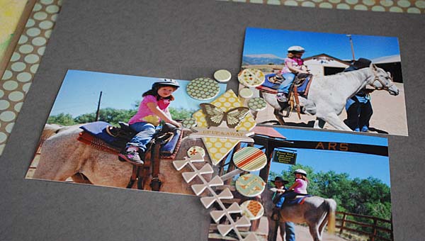
I made a layout made with the July Scrap Room kit. Their kits are unique – instead of one big cohesive kit you get smaller bite sized kits, and I love that variety not to mention how easy it makes it to create and incorporate into my own stash. For today’s post I chose to stick with the kit that had a beautiful grey cardstock and Pink Paislee Prairie Hill collection dimensional stickers and paper.
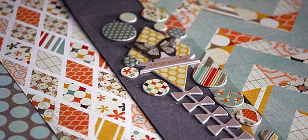
As I went over in my kit series a few weeks back, the first thing I do is think about “well, what do I want to do with this?” My answer was almost immediately “something from Colorado…” and I flipped through to see what I’d like with that aqua, orange, and grey [a combo that I’m surprised to find that I ADORE]
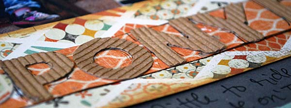
Instead of getting super into what supplies I’d need from my own stash, I first figured out what I’d actually be making, and how I’d utilize the paper and stickers in front of me.

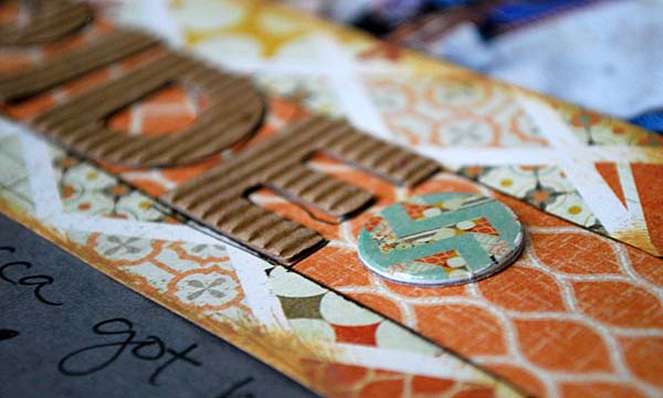
Then, after I had my photos + papers all settled I figured out I just needed some ink, gold paint, a pen, and some kind of alphabet stickers for my title.
Here’s my finished page:
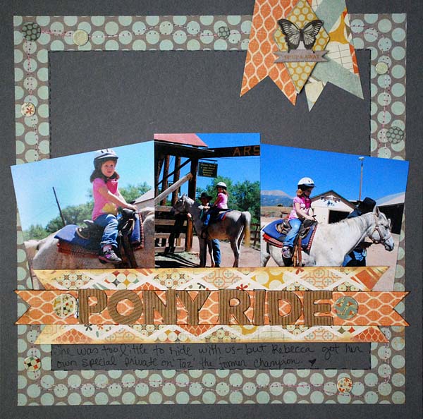
I have to tell you – this page wins the prize for being my favorite page made in recent memory. Something about it… I just LOVE how it turned out!! It was not my intention to crop down my 4×6 photos to pictures that were more like 4×4 1/2 (and 4×3, in the center) but they were croppable, it worked, and I love it!
I definitely give credit to Scrap Room for picking a great assortment of goodies for me – and I thank them for being today’s sponsor too. Such a unique take on kits, and the small size is really great for getting creativity going.
Yes- today’s post is sponsored by The ScrapRoom, and I used their July kit in the above project. They are generously offering that if you join The ScrapRoom for the first time and mention “CampScrap” in the comments section of your order to receive a FREE Layout kit in your first shipment!
We do have a Facebook page (The ScrapRoom) and of course, our blog link: http://thescraproomblog.blogspot.com/
Loving this layout as well! Especially the banner cluster on top. I will be recycling that look onto a page in the future! Thanks, as always, for the inspiration!
Love this mix of patterned papers and the visual balance!! Great job, May!
Super cute layout! I love those cardboard letters! The paper is gorgeous too!
I love this layout too. The colors work really well together.
Love this layout!
Fantastic layout! One of my faves.
May, I absolutely love this layout. It is a little different than what I have seen you create, but yet it still has your unique style. Really cool!
I too adore the aqua/orange/grey color combo, and this page rocks! In fact, as soon as I saw the final page I thought “sketch” – it’s a well-balanced design that would be useful for lots of pages. Off to check out The Scrap Room.
Love this layout! You make everything look effortless. Thanks.
Love this too and the dimension/layering it shows. I need to get better at that. Thanks for sharing!
Love the layout. My favorite parts are the colors and the stitching on the border.
Love that Prairie Hill collection. And it works great with those Colorado photos. I like the frame-in-frame look you achieved.
Well as others have said, love this layout! I think it would make a great sketch, I like all the banners and the way the frame is not the same width top and bottom. Want to have a go at my own version of this one, for sure. Just need to get my week of pesky late spring cleaning finished. There’s another full week before school breaks up here and for us its traditionally a time of getting sorted.
** Kate **
I love this LO too and will be lifting it for sure. And I also love The Scrap Room kits – I’ve been a subscriber for a while now!
Fabulous layout. I can see why it’s a fave.