I’m working with Studio Calico’s July kit again today – and I’ll continue to use, and show you how I work my way through it.
Yesterday we talked about what to do when getting started, today let’s talk about making the best of a kit. When working with a purchased kit, it makes sense to me to utilize it first and foremost as a kit. That isn’t to say you can’t mix it with other supplies, but for today let’s focus on using the kit as it is.
The first thing to do when working this way is to follow where the kit takes you as far as inspiration. You’re not going to force those pink floral photos to work with a blue, green, and brown outdoorsy kit. Nor is your idea for a very vintage page going to happen with a modern looking kit. This isn’t to say these things would be impossible – but you’d be fighting your kit.
We want to befriend the kit. Work with, not against it.
So when you think “well the first idea that comes to mind for this is ___” – try that out. Roll with it! You might pleasantly surprise yourself as I did here with this card:
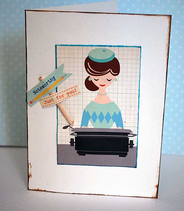
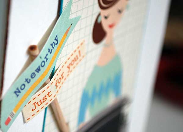
In retrospect I could have more gracefully tucked in that stick with the stickers… but I’m good with it. The point is I thought “how cute would these ladies be cut up for note cards?” Just chop a lady out, edge her with ink, attach her to the front of a cream card (that is also inked) and you’re good to go. Adding a “note” or “thanks” type sentiment stamp would work well. I just used some of the banners from the kit.
The best part? That sheet of paper has like 15+ of these ladies. BAM! I’ve got a whole set of same cards (well, similar cards) and I bet I could get it done in under an hour. That’s cool! If I had fought the kit, if I’d struggled to find a scrapbooking use for this lady paper, I’d not have made anything at this point, and I’d be less satisfied too.
So what happens when you look at a kit and you just can’t imagine any use for it?
Well first I’d call you out for that. You’re a paper crafter, yes? So craft with it! But seriously – if you need inspiration, and we’re talking about either a kit club kit or a kit from a specific manufacturer line, check out their site.
Companies spend a lot of time and money getting product out to their design teams, who in turn spend a lot of time creating projects and photographing them to share.
to SHARE.
Yes, the whole point is that they share those projects and hopefully inspire the company’s customers. If they have a really strong team (and Studio Calico has an insane off the hook amazing one) then that is all the better because you know you’ll find inspiration! Even better, they’re mostly using product from the kit, which means you have the same stuff as them and can easily scrap-lift! Now, there is more than one way to go about getting inspired by a kit club design team and I’ll share that now:
- See a specific project you really like, make notes or a sketch based off of it, recreate with your own kit.
- Get a more ‘in general’ inspiration by browsing their gallery, then go back with a mind full of swirling ideas and see what happens
- Make notes about specific product uses, note how certain papers or embellishments are getting used
- Watch company’s blog for tutorials and how-to using the kit
There isn’t a wrong way. I looked through the Studio Calico July kit gallery and was inspired by so much – but a layout I saw by Kinsey Wilson really stuck in my mind. Her use of stamps and little bits made me remember that I have a wealth of 2×3 photos at the moment and I took off with that in mind.
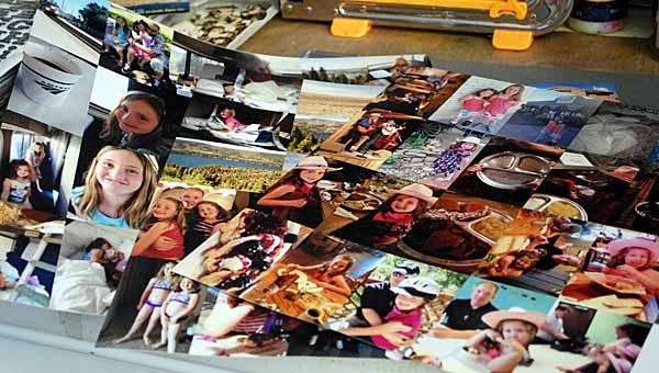
I normally am a 4×6 scrapbooker, however for a recent trip I decided to print out my iPhone photos sized to 2×3 (and I had them printed on 12×12 sheets of photo paper from Persnickey Prints) so that I could use them to accent. One thing I’ve noticed in my scrapbooking is that when it comes to vacation photos, I tend to leave out iphone pics… I thought this might work some more in and be fun to try. I’ll keep you posted as to how that works out.
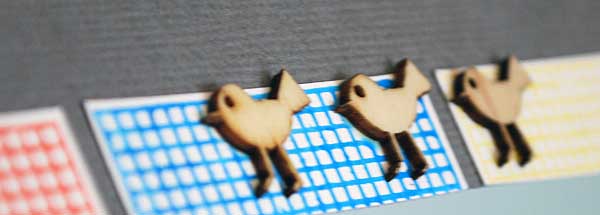
First thing, I stamped the square kit stamp a bunch…
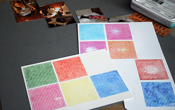
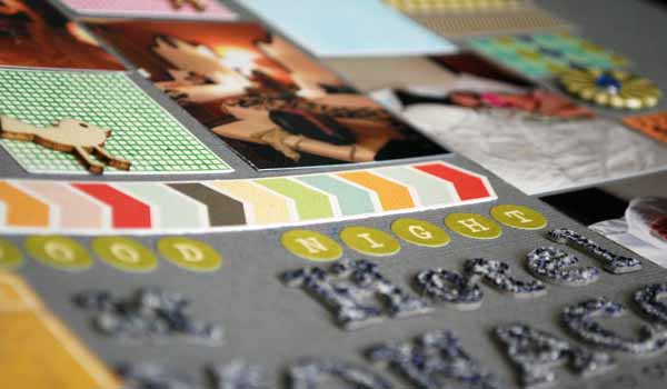
Then I cut stuff out and assembled. Now you could directly scraplift a page – I didn’t go back and refer to Kinsey’s page I just did my own thing based on that one look I got. I like how hers was “crooked” better than doing it straight as I did – but that’s ok. This kit stamp was perfect for this kind of a page!
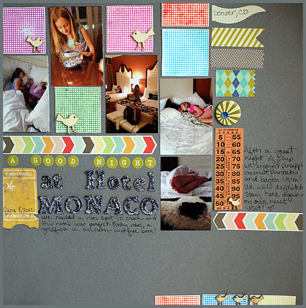
I put some picket fence distress stickles on my title… wish I hadn’t once it dried but oh well! Other than that, I really had fun with this and I LOVED having a finished picture in my head before I started. This got a lot of the pieces and bits of the kit utilized as well as being a fun thing to do and totally outside my normal look.

The great thing, is that instead of pushing my brain to come up with something completely groundbreaking or original, I made both of these projects during 2 episodes of Burn Notice. Not shabby for less than 2 creative time hours! Now I love getting really wild and coming up with my own big ideas – but the point of today’s projects and post was to NOT do that.
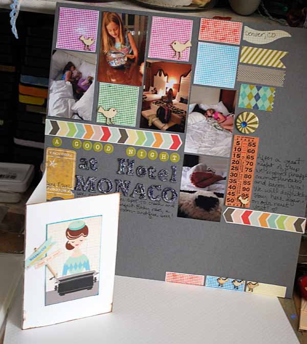
The point today was to work with the kit, to let it lead your choices. Once you’ve really gotten some good use out of that kit, you’ll be ready for the next part [which I will share with you tomorrow!]
Today’s post is sponsored by Studio Calico, and the products shown were all from their July kit (with the exception of the pen, inks, glitter glue). 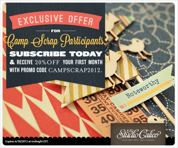
Note: Their July kit may already be sold out, but the offer stands for starting with a future month! If you would like to take advantage of the generous offer shown above email WaitingList@StudioCalico.com to get set up for a subscription.
I love both the card and the layout today! It’s great to see how you are using your kit because it helps me look at the contents shown from a whole different point of view. I think this card is adorable and love that you can make 15 similar cards so easily. Like you, this paper would have left me wondering how to fit it in, even though I can tell I would love it. Thanks for the new ideas.
Great ideas for what to do with a kit! I love the card, and those ladies sure remind me of Mad Men so I can see making a whole little collection of cards with the paper!
I love this series on kits that you’re doing! It’s very helpful, and I do this a lot myself. I tend to make my own kits up by just using certain paper, and I have a box of embellies that I’ll work out of. Your suggestion are awesome. Your card is very cute! TFS.
I love what you’ve done with this kit. I appreciate all the tips on using kits too.
Love that L/O! I keep getting stuck on what t do lately with my larger photos. I love the way the little 2 X 3 photos look on the page much better. Think I will give this a try. Love the papers and embellies! TFS 🙂
What fabulous ideas! love both the card and grid lo…..you are so inspirational! Thank you
Thank you for your tips on creating with a kit. Your cards are cute and I love the layout. I love the stamp so much I just may go on the wait list for the kit to get the stamp.
No more saying you are not a card maker! That would be a very hard card for me to part with so be sure to send it (if you do) to someone truly appreciative of your talents. I am wowed by your use of space in that LO. It made my eye travel all around not wanting to miss any details. Fabulous! I’ve been playing with the July Simon Says card kit and doing just that…pretty much sticking to only what was in the kit with just a few tiny additions that begged for them.
Thank you!
You gave me some great ideas this morning. First. Work with the kit. This is what I rarely do. I often procrastinate. Hoard. So when I KNOW I want to do a jellyfish page with a certain kit, I should just go ahead and do it.
Secondly. That idea of printing my cell photos as 2×3 is a good one. My cell pix are lo res and never look very good when I make them 4×6. Go with it instead of fighting it. Thanks so much.
Loved this post and have felt so many of the same emotions when looking at precious crafting supplies – tfs!
That card is so cute. The girl fits perfectly in it too.
I love seeing how you’re coming along as a card maker! This card is darling! I loved the inked edges!
I typically use 4X6 photos too, so it was cool to see you using a different size. Maybe I’ll step out of my comfort zone and try new sizes for some of my pics. The layout was too cute!
Thank you for also telling us that you weren’t happy with something that you did. It’s always nice to know that we’re not alone when it comes to not liking every little thing on every single layout.
P.S. – I’m a huge Burn Notice fan too!
I love the layout, love the coloured grids for accents, and that cute gal on the card…great idea to use her!
Great projects May!
May-I am COMPLETELY loving these kit club posts and I’m not even a member of any kit clubs! So much good info though and I want to try and make some kits from my stash. Totally LOVE this layout-it might be my all time favorite of yours and personally I like your straight look better than the offset one. GREAT JOB and thanks for sharing!