It came up again this weekend, and I’m always surprised when it does. I was asked “how do you deal with having such dimensional pages when you go to put them in albums?” and this always surprises me because my pages are almost never more dimensional than a brad or button! That said, making a flat page with a dimensional look is always possible too – and today I’m going to show you how:
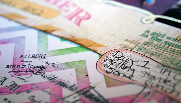
First off – here are some tips:
- Use a mistable/color magic paper (or white cardstock!) and use mists or inks and blend them in to get some color depth.
- Layer papers
- use rub-ons, stickers, and stamp images onto paper
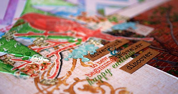
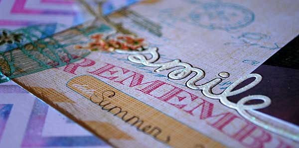
The trick is to layer flat stuff, so you get depth without adding thickness. I had such fun with this page. I started with new Tim Holtz summer distress colors and I colored a piece of Heidi Swapp’s Color Magic paper (don’t know how this works? check out my video on Color Magic here on YouTube)
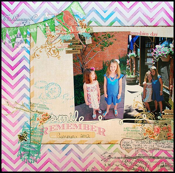
Does that look like a boring flat page to you? No way! Supplies used:
I’m looking at that supply list and chuckling to myself – those are ALL total favorite “May” supplies. No wonder I had fun and liked how it turned out!! I’m telling you these summer distress colors are a MUST have. LOVE that brightness!
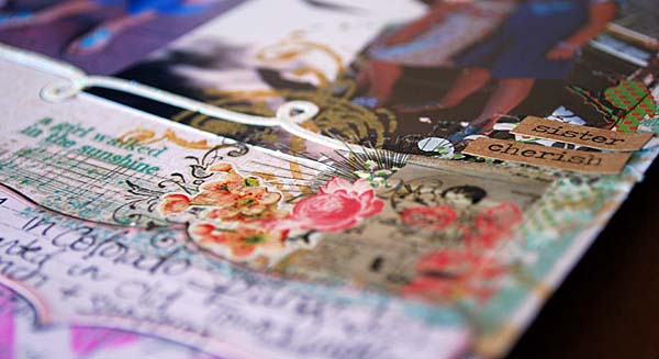
They are popping up in stores everywhere, making it easier to find + buy them. Here’s an enabling tip… don’t forget that over at Inspiration Emporium if you use the code campscrap you can save 10% off an order! [here’s a link to the inks there!] Oh and let us not forget my beloved Color Magic paper. It lets me play with inks and mists, blend stuff, play with my crafting, and just really add so much depth without adding bulk. LOVE that paper.
I hope you enjoyed today’s layout, and that you have a fabulous Monday!
Today’s post is sponsored by www.designerdigitals.com

Not only do they have a great community, but the shop is updated weekly and absoultely amazing. Katie Pertiet is a master,


What a lovely lay-out! And I love the tips you’re giving us, thank you!
Your layout is wonderful May and it really looks dimensional! I love the “smile” with the outlines and running across both pictures.
I LOVE this page! The colors are fabulous and I have many of the supplies you used, so I might actually be able to come up with something similar! Tim’s bright, fun new summer ink pad is on the way to me. Can’t wait to play. Thanks so much for sharing your layout!! You do make it look easy (even though I’m sure it takes time and patience). Have a great week.
Love this layout & thanks for the great tips. I’ll have to look into that color magic paper.
Hi May, I just love the happy colors in your LO. One of my favorite things about LOs that feature your daughters together is how you always capture Becca looking up at her older sister. Precious.
What an eye-popping page May. I especially love how you layered the rubons right on top of the painted banners. I don’t think I would have thought to do that. I would have found a flat piece of cardstock, but I love the look of what you did! Thanks for sharing with us!
Amazing layout May! I love the way you embellish all of your pages that make the pictures pop off the page even when you use bright bold colors. Your pics are just beautiful as always. Thanx for sharing and for the info! 🙂
I totally love the bright Tim Holtz colors and the Heidi Swapp Color Magic paper! Your layout is gorgeous! Flat can be fabulous! Thanks for sharing the great tips!
Love your flat layout and how much dimension and color it has. Thanks for sharing. I really want some of that color magic paper!!!
May, you are such an enabler. You create some awesome pages using products that are way cool. Now I need the Color Magic papers. I do love your flat lo. The summer colors on the chevron paper are wonderful and work perfectly as the background to the photos of your girls. I want to add that I am loving Camp Scrap and the Community at BPC. I have not had the op to create that I thought I would. I am working on the table decorations for my niece’s bridal shower. It will be a travel theme so I am busy die cutting, creating a hot air balloon, covering a smallish box to look like a vintage suitcase and the list goes on. If it so happens that I can use some of the techniques from CS on this project, I shall and then post.
Super layout! Love the summery chevron paper in the background and all the wonderful bits and pieces you clustered together.
Ooh I love those colours. Need to get some of that Heidi Swapp paper too! Great LO May