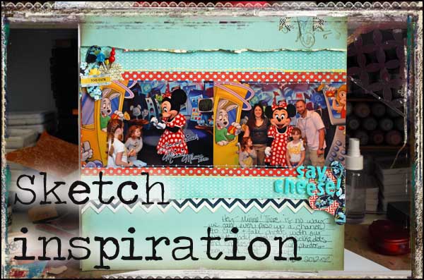
While I don’t use sketches much anymore, I actually do use them quite a bit.
Wait – what?
What I mean is, there are basic blueprints in my mind that I know work, that I know I can utilize my 4×6 photos with for scrapbooking and that I can customize for my stories. Today I want to share a favorite sketch with you – and show you how I used it on a card too.
This sketch as you can see has very little to it.
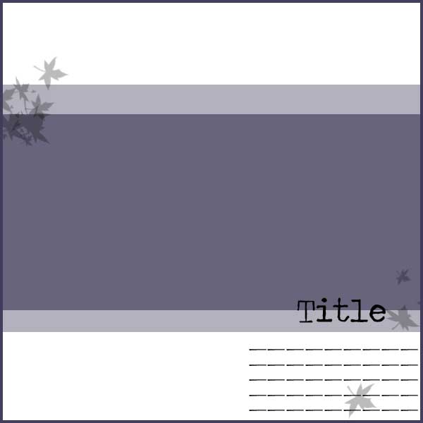
This is because depending on my photos, my papers, and my story I can edit it to make it work for whatever I happen to be working on at the moment.
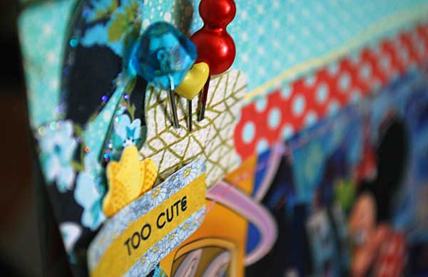
Here I have used this sketch with a ScrapRoom page kit:
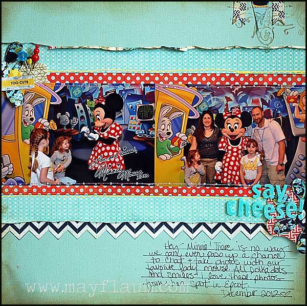
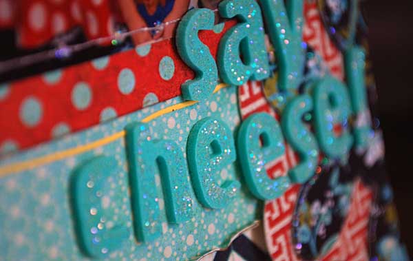
I really like the bite sized kits (perfect inspiration for a page or two!) – and with just added touches I really like how this layered page came out.
Links to supplies used on both projects:
I took a different ScrapRoom page kit and used my sketch inspiration on a card:
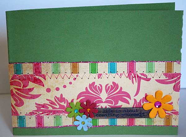
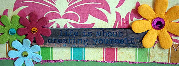
I’m super inspired to try and use more of my page sketch designs onto card format – I really like how this one came out!
If you’re inspired to try something with this basic sketch – I hope you’ll share a link with us here, or better yet share it over at the Camp Scrap (FREE) community at Big Picture Classes.
Happy Crafting!
Today’s post is sponsored by the ScrapRoom, and I used their June kits in the above projects. They are generously offering that if you join The ScrapRoom for the first time and mention “CampScrap” in the comments section of your order to receive a FREE Layout kit in your first shipment!
We do have a Facebook page (The ScrapRoom) and of course, our blog link: http://thescraproomblog.blogspot.com/


I always love Disney pages, and this is no exception! Wasn’t familiar with The ScrapRoom, but their kits look interesting; thanks for featuring them. Lately I’ve been playing with more basic sketches like this one, as ‘page starters’; a new concept for this sketch-lover. I’m definitely giving this one a try!
I LOVE sketches (took Double Take and I’m still working on it) so this speaks to me.
I hadn’t thought about using page layouts for cards, but great idea. Love all the inspiration. Thanks loads, May.
I totally rely upon sketches for scrapbooking, and this one is a great one for a starting out point! It’s simple enough to always have in mind and I’m sure going to try it on a card too! And maybe I’ll add some sequins to the card…
I do like a sketch for a starting point. I love the way you have stamped over the pennants in your layout – not seen that before but it works really well so will have to try to incorporate that in my layout I think.
I love what you did with the sketch on both the layout & the card.
I’ve always needed sketches for layouts but oddly not for cards. I love the idea of them being interchangeable and your sketch is one I will want to try for both.
I love this sketch. It is versatile. I also like the use of white and red polka dots next to black and white chevron. Can’t wait to try it.
Great sketch, LO and card May! And I love the Scrap Room – I’ve been getting their kits for nearly 5 years!
It was not until I took Double Take with you and Nic that I truly appreciated the value of sketches. I truly have stubbled way too much with the wonderful pastime because I would be stumped with a lo. If only I had turned to sketches, many problems would have been solved. Usually I know exactly how I want to place my photos, but when there are more than 10, a sketch is a valuable tool.
Thanks for the great sketch May! It was truly inspiring. Check out my blog post with my Camp Scrap layout:
http://aplaceformyscraps.blogspot.com/2012/06/camp-scrap-sketch-inspiration.html
This sketch can work as a jumping off point in so many ways, I’m sure I’ll keep using it! Here’s the first layout I made using it http://squirrelyart.blogspot.com/2012/06/we-got-cows.html
That was fun!
http://mayadahan.blogspot.com/2012/06/inspired-by-camp-scrap-card-and-layout.html