
This was the first project I made for CHA (for Tim), and to say it took forever would be an understatement. It took 2 days!! But in truth that isn’t because the page is especially hard, it’s just because I was being ultra careful not to ruin any of the beautiful new goodies. Today I’m going to walk you through the page.
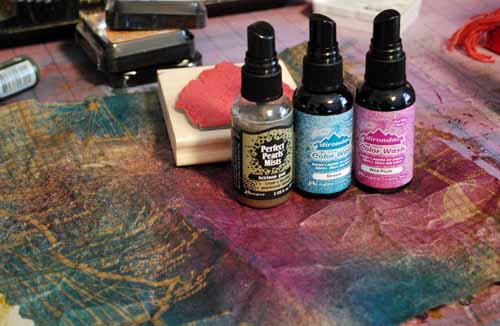
I started by misting the fabulous kraft resist paper background with Adirondack color washes, then Perfect Pearls mist in heirloom gold. (the stamp behind them in photo has nothing to do with it – it’s just keeping paper from curling). When I was done I washed the paper (yeah, really) in the sink, crumpled it all up, then put it under some heavy items to dry.

The next step involves the grungeboard accent. Now – you need to do a few steps and it’s easier explained in video… so here you go:
[youtube=http://www.youtube.com/watch?v=9V4enqGlFRw]
My video skills are lame and I have no editing – but at least I tried! Here’s the finished page:

the photos are a 4×6 and 4×4 print (4×4 is a hipstamatic from iPhone). Now let me tell you more about the details:
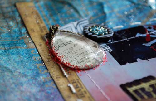
I adhered (with glossy accents) a facet to a sticker (shown above) and adhered it along with a button and scrap of tissue tape. My photos are stitched down (machine) since the background is pretty wild and I didn’t want photos falling off. I also did some hand stitching up the left and across the right (on ruler sticker, seen above) by using my Tim Holtz design ruler to measure and punch holes, then embroidery floss and needle to stitch it. LOVE the texture + detail this adds.
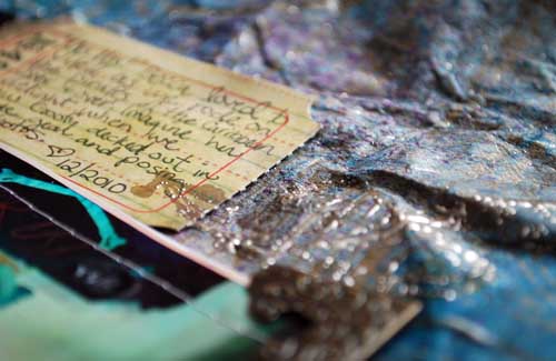
I used a journaling ticket (LOVE THESE!) for my notes, and I did add some gold UTEE (embossing enamel) here and there to add specks of golden lovliness. I figured pirates like gold.

Now it gets real funky. I die cut flourishes from the new kraft glassine material that Tim has, dabbed distress stickles on them, and glued them to my layout (by the grungeboard accent)
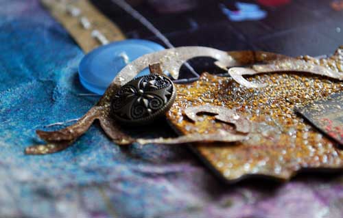
I also adhered my letters to the surface (see video for details) with a mix of distress stickles and liquid adhesive.

I’m having such a good time maybe I haven’t mentioned it… but I *LOVE* the new stuff Tim came out with. It’s fantastic!! ALL OF IT!
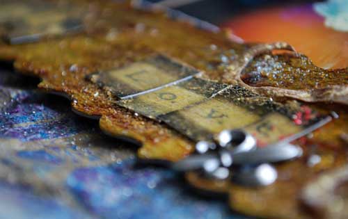
I hope you enjoyed my up close look at this project!
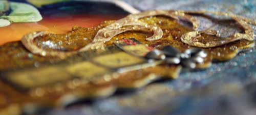
I will continue to share the up close looks at them here on my blog. If you have any questions – please do feel free to comment here or email me. I’d love to hear what you think!
that is stunning May
Love how you crinkled the paper first, so cool.
This page is freakin’ awesome! I love everything about it!
This is way cool. There are a lot of steps involved when using some of Tim’s products, but the end result is way worth it. I have some utee which has never been opened. I really do not know why, but I do know that I shall be using it on a project I am doing today and tomorrow during the big snow storm coming my way. Love the dancing with Goofy! Both of your daughters are absolutely adorable!
Hi diddle deee dee!
Thanks!!! 🙂
Thank you so much!! You know, much of Tim’s stuff needs a few ‘steps’… but it really isn’t hard, nor does it require a lot of time and effort. Just one of those things that has to be remembered – or learned. 🙂
Can’t wait to share more!
May
OMGosh so cool!!!! You are so creative! You should show that video in class one week. Love seeing how you got soooo much texture from the crackle paint, distress ink and UTEE!!! And best of all it is such a good technique for a boy page especially one with pictures of very smelly, dirty after camping boy scouts! Awesome! Are the journaling tickets a new TH product?
Oh I have plenty of fresh exclusive material & presentations (no videos – this is a new thing for me… but maybe in future classes) for class. 🙂
Loved the unedited video…especially when you say, “…that’s okay…” LOVED that! 🙂 Thanks for taking the time to show us the techniques.
That looks fantastic. Thanks so much for the video – it is so helpful to see how you do things. And I downloaded Hipstamatic and LOVE it!