The creative journey continues forward! If you’re just joining me, I’ve been writing a series of posts about my personal creative journey. Today, a seemingly small topic: neutral colors of paper/cardstock…
What neutral are you? I know people who don’t go anywhere without a black purse. Those who prefer shades of grey, chocolate brown, cream over white… for ‘neutrals’ there is a lot of variety and possibility.
So I ask again, what neutral are you?
I didn’t know that I had a neutral for a long time, but once I found it, it really helped me along.

Back in 2006 or so, I finally figured out that black or white are NOT good choices for me despite them being the popular and obvious choices. Cream and kraft are my best neutrals. They work the best with the papers I lean towards, the patterns and styles I go for, in other words – they’re more ME.
Now I’m strictly talking scrapbooking here – and it’s not to say I don’t work with white. No, I’m talking more in a ‘what cardstock do I use and neutral do I feature’ sense.

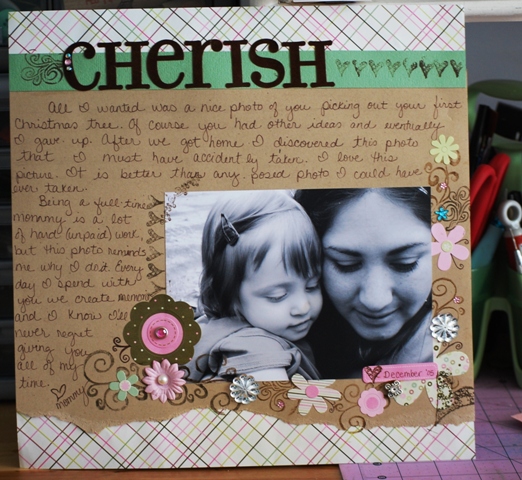
(layout above from December 2005) It was sometime in 2006 that I figured it all out, and I found that I could still use black pen for my journaling (as I still do 99% of the time), that I wasn’t limited or fenced in, that knowing my neutrals simply freed me when I wasn’t sure which way to turn.

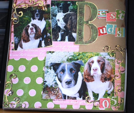
(page above from 2005) In fact, I could print on the kraft cardstock and use it anywhere, anyhow I liked. I even discovered that “shopping bag” colored acrylic paint was a good idea. You’ll note these pages I’m sharing aren’t my “best work” – but that’s ok. Why? Well sometimes seeing what you do and don’t like when looking at past pages doesn’t take the form of ‘best’. These are the layouts that helped me find my kraft love way back in the day, and so I share them with you for that reason.
Fear of failure in my craft projects? Work past it. Working past fear is the only way to have a great time and make new discoveries.

(above, layout from 2005) No, all my pages weren’t awesome, but finding out that I lean towards those neutrals, and making more of a focused effort to reach for them has been great for me creatively.
Finding my style meant a lot of going back to finished pages and noting what I did and didn’t use and like.
The supplies you buy and like vs the supplies you USE are two totally different things. A very noteworthy difference, especially when finding your style.

Finding my own style became less about putting a label on what I am, and more about figuring out what works for me, and getting a better understanding of what *I* like.
I’ve been trying to mix up my neutrals lately (just to stir the pot and keep it interesting) but it really hasn’t happened. I’m a kraft cardstock girl. I purchase it in packs of 25, and it will remain my #1 until some other color can do all that it does. For me, it’s the perfect neutral.

(above page from 2010 CHA show – all product outside cardstock is the girls’ paperie)
note: I’m a cardstock freak. I adore it. I even made an instant download class for Big Picture about it. More on cardstock, as well as more creative journey posts to come…
If you have any questions, or topics you wish I’d cover please do feel free to leave a comment or e-mail me at mflaum @ comcast . net
I am just loving this creative journey series! I was just feeling a bit frustrated this morning and looked back through it and it really encouraged me:)
I just love that cupcake on your “Sweet Thing” layout and ohhhh……Rebecca has seriously GREAT hair!! My neutrals are kraft, cream, and gray. Sometimes light olive green works as a neutral for me, too.
As always, I love hearing about your creative journey. I have a few questions/thoughts for future posts:
*How do you feel about having so much personal information about you (and your kids) out there? Was it a difficult decision? Do you have many LOs that you would never publish because the subject is too personal or would otherwise invade your privacy or that of your kids? Do you worry about this? How do you handle photos that have pictures of other people’s kids that you might otherwise post on your blog?
*I’d love to hear about your first (presumably wide-eyed) visit to CHA.
*Do you mourn the loss of certain manufacturers that have closed up shop over the years? Or are there enough newbies to help you forget old favorites? Do you make a conscious effort to use only current product since you are published?
*What is your personal method for keeping track of what manufacturers’ products are on each of your LOs?
OK, that’s probably enough for now!
Cindy
Still enjoying these posts May!
WOW – so many great things to think about! 🙂 I really appreciate the feedback and hearing what you might like to hear about. I’ll be getting into some more of this for sure – for now, a few things:
1. Privacy is a no-brainer to me, and my view is this. There’s nothing truly private, invasive, or highly personal that I post within my pages that I wouldn’t tell a stranger. My GOLDEN RULE for on-line anything is to not post anything you wouldn’t be ok with everyone in the whole world knowing. You won’t see the front of my house (or street name!), nude pics of my kids (bath or not), painful art journal pages, or other things I don’t want the whole world to see. This keeps things at a level I’m comfortable with, and I think that level is different for anyone. Same goes for blog content, etc.
As for other people’s kids, I really don’t post much of my stuff (outside perhaps a class situation) where I have pics of other kids. If I do I ask permission and/or don’t name the kids. When E gets going in her school I’ll probably just blur faces. 🙂
2. My first 3-4 tradeshows were as a buyer for LSS, so no time for wandering, it was order, order, save store money, order! By the time I got to go as ‘designer’ it was old news. 😉 That said, I will do a CHA post. Good idea!!
3. YES! I totally mourn loss of mfgs, but I try not to dwell. (hello – no more foof-a-la, no more Rebecca Sower products… tragedies!) I keep and use any product I like – discontinued or current. The only time I make the conscious decision to use current stuff only is in my classes. I don’t want to use stuff impossible for students to find.
As for how I keep track, well it’s just in my head. If I have a patterned paper or sticker I don’t think I’ll remember I make a note on the back of the page. Otherwise I just remember… I am a freak in being able to identify my supplies! 🙂
Thanks SO much Cindy for all the great feedback!!
Love me some kraft as well. Thanks for sharing your past LO’s and how you got to where you are. I so love this and wish more people would do this. I need to as well.
Very interesting Professor Watson! It also helps explain why I have a huge collection of Sassafras Lass which I love looking at it-it’s so bright and cheerful-but lack the ability to use. I decided just this week I’m an October Afternoon and Pink Paislee type of girl which I love to pair with my also huge stack of kraft cardstock! I think I would accomplish more if I did not overwhelm myself with stuff I like to look at as opposed to stuff I actually use. Of course you have to factor in the “guilt” for buying the stuff and than not using it! So I waste more time trying to create something with items that are totally beyond my talents so I won’t feel so bad about wasting the money!
This is such a useful series, thanks so much May.
Thanks too for posing the question ‘what neutral are you’.
I have used kraft coloured card stock and have been reasonably happy with the pages, but until you asked the question I hadn’t realised that the neutral I more naturally turn to is grey. And the pages I’ve done with grey backgrounds are the ones I like even better and ‘go with’ the papers etc I more naturally use. I don’t know if I’d have figured this out without that prompt!
BTW – have a great birthday! Hope your family are going to do something nice for you and make you feel like a queen for the day.
The Spring Has Sprung and Cherish layouts are so cute! Love the doodling on the spring one. 🙂
My question is about punches. What are your favorites..do you make your own flowers. I think it would be interesting to know if there’s other “great” punch manufacturers out there..this coming from a die hard Fiskars fan. I’m starting to look at Martha Steward and MaGill but wondering if they’re as great.
I’m such a fan of that BG Phresh and Phunky line you used in your LO! And I’m a kraft fan too. But because I use a lot of bright colours I use black and white as well. This is a great thing to think about … and quite timely as I’m doing a LO a Day challenge with Lain Ehmann for the month of May and the theme is discovering our own personal scrapping style!
Another fun chapter to read. I’ve recently discovered kraft cs thanks to Cathy Zielskie’s DYL class. I agree it’s a great neutral, seems to go with everything.